9.1 Intro Slides
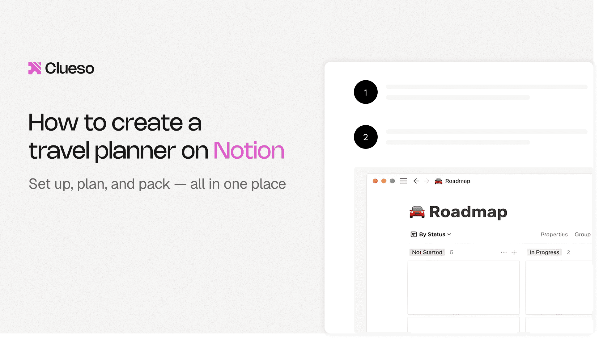
What you're creating: A clean, outcome-focused opening slide — 10 words max on the title, subtle background, soft motion, and high-contrast typography.
In the first few seconds, viewers want to know: "What am I going to get?"
Focus on the outcome
- Example: 'Record crisp 2K screen captures in under 3 minutes.'
Slide elements
- Title: 10 words max
- Logo: small, bottom or corner placement
- Background: subtle — gradients or a blurred product shot
- Avoid: busy UIs and distracting animations
Motion guidelines
- Use a soft 10–15% scale-in or a subtle wipe
- Keep transitions short — a soft wipe with ≤0.3s easing
Accessibility tips
- Font size: 64–80 px minimum at 1080p
- Contrast: high — light text on dark or vice versa
- Safe margins: keep text away from edges (10–12% padding)
Examples
a. Bad Intro Slide Example

What is not working:
- Distracting animations
- Different font styles and sizes
- Lack of alignment
- Use of long sentences
- Part of the text is too small to read
b. Good Intro Slide Example
9.2 Chapter Slides
What you're creating: Consistent, rhythmic chapter markers that create breathing room and help viewers navigate — on screen for 0.5–1.5 seconds each.
Chapters keep rhythm and help your viewer breathe between steps. The slides break your video into clean, digestible chunks. They are helpful for both human viewers and algorithmic navigation (e.g., YouTube chapters).
Slide elements
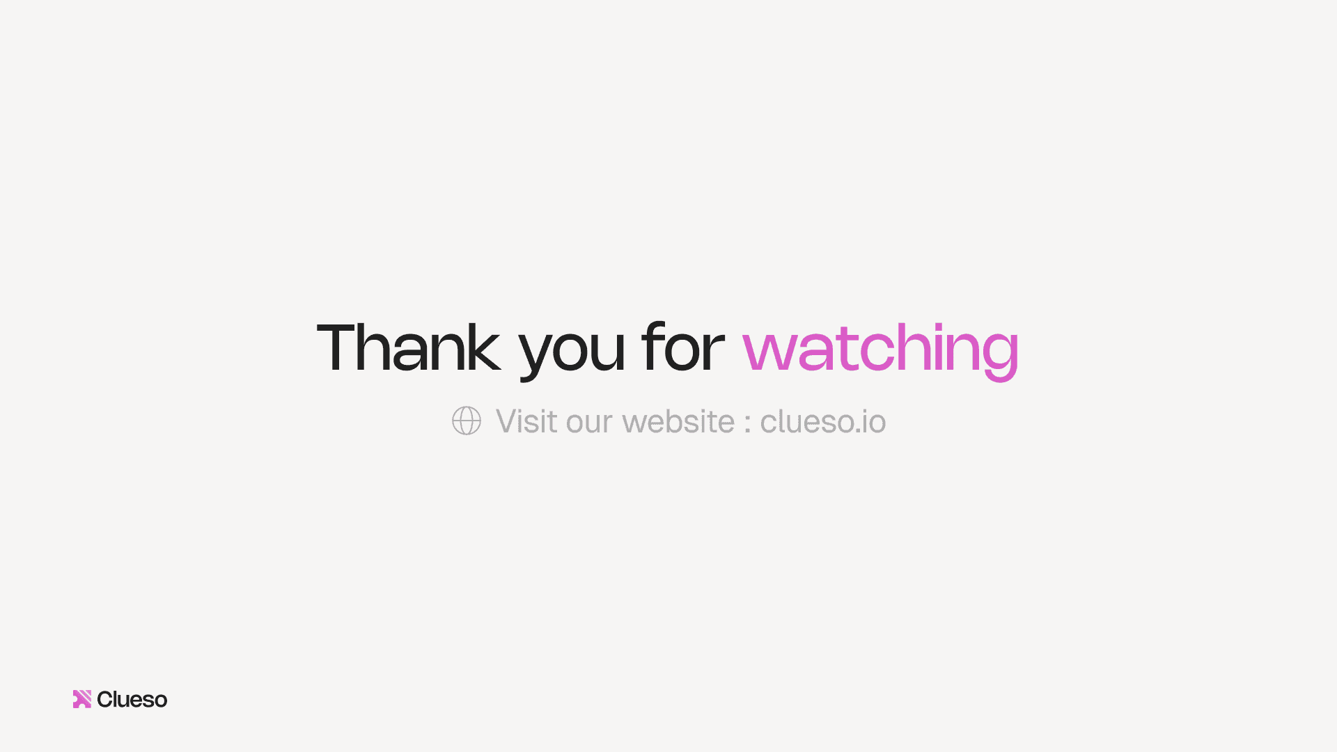
- Text format: numbered step + clear label — e.g., '02 Write a Tight Script'
- Placement: same position across all chapters (e.g., bottom-left)
- Background: light blur or neutral tone for visual separation
- Avoid: extra icons or clutter
Motion guidelines
- Keep intro visible for 5-10 seconds
- Short, consistent transition in/out — quick fade, slide, or wipe ≤0.3s
- No exaggerated zooms or complex transitions
Accessibility tips
- Font size: 60–80 px minimum at 1080p
- Contrast: ensure readability on all backgrounds
- Consistency: do not shuffle layout between chapters
Best practices
- Limit to 3–5 chapters
- Keep each on screen 0.5–1.5 seconds — just long enough to register
- Use same font size, color, and position across slides
- Rounded corners? Stick with one radius
Examples
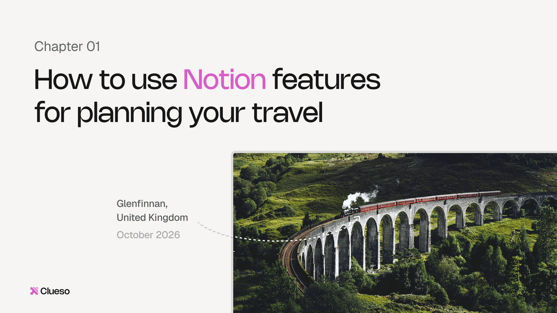
a. Bad Chapter Slide Example

What is not working:
- Busy background creates visual clutter
- Lacks consistent layout
b. Good Chapter Slide Example
9.3 Outro Slides
What you're creating: A clean closing slide with one confident CTA — short recap, memorable URL, and enough time on screen to support end screen elements.
The final slide is a soft close plus a next step. Wrap it in one line, then give viewers a clear direction.
Slide elements
- Recap title: clear, confident summary of what they've learned
- Primary CTA: one action only. No 'and/or.' (watch next, try template, download presets, or read docs)
- URL or button: short and memorable — e.g., yourtool.com/record
- Avoid: multiple competing CTAs
Motion guidelines
- Gentle fade-in or slow scale-up
- Keep outro visible for 10–20 seconds to support end screen elements
Accessibility tips
- Font size: ≥64 px at 1080p
- Contrast: high-contrast CTA button or label
- Safe margins: maintain it so that CTAs don't overlap YouTube overlays
End screen layout (optimized for YouTube)
- Left → Next video
- Right → Playlist
- Bottom → Subscribe button or trial link
This layout balances visual weight and guides viewer interaction without overwhelming them.
Examples
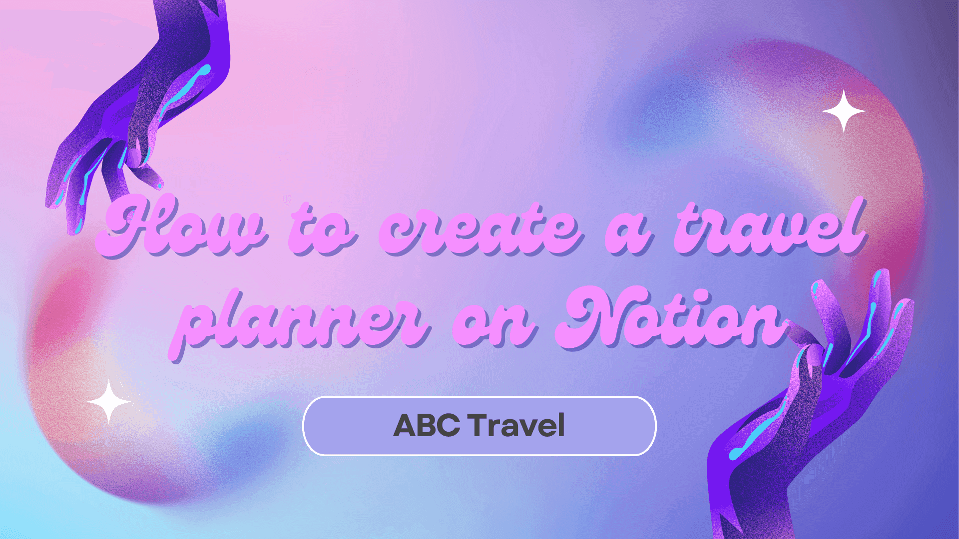
a. Bad Outro Slide Example
What is not working:
- Multiple CTAs competing with one another
- Website URL too long to remember
b. Good Outro Slide Example
9.4 Adding Video CTAs
What you're creating: A single, tangible CTA that turns the learning moment into an action — watching the next video, trying a template, or downloading presets.
A screen-capture video should give viewers a clear next step. Whether that's trying a feature, downloading a preset, or watching the next video, your CTA is where the learning becomes action.
CTA design guidelines
- Use a high-contrast background (brand primary or dark translucent box)
- Keep copy short: 2–4 words max
'Try the preset'
'Watch next video'
- Respect the UI: safe margins, no overlays covering critical interface elements
- Match your slide or label design for visual harmony
Effective CTA types
- Next step: point viewers to the logical sequel — e.g., 'Watch the advanced editing guide next.'
- Try now: link directly to a trial, template, or feature — ideal after showcasing a specific tool or workflow
- Download: offer presets, checklists, or example files — works well for guides or toolkit-style videos
Soft mid-roll CTA
- Place after delivering one clear win (e.g., after a polished recording segment)
- Use a 3–6 second lower-third overlay with voiceover like 'Download this template in the link below.'
- Keep it subtle — no music dips or animated buttons
Hard end CTA
- Show on the outro slide + end screen, make it the only action
- E.g., 'Try it yourself →' or 'Watch the editing tutorial next'
Make it tangible
- Skip vague asks like 'Subscribe for more.' Instead, tie your CTA to a real outcome:
'Record your first 2K capture with this preset'
'Download the exact export settings used in this demo'
'Watch the voiceover tutorial to add clean audio next'
This language feels useful, specific, and trustworthy — which is what your video just delivered.
Use short and memorable URLs
- Use URLs viewers can remember or type — e.g., 'yourtool.com/record' instead of 'yourtool.com/resources/export-settings-tutorial-video'
- Use branded short links where possible (go.brand.co/preset)
- Mirror the link in the pinned comment, video description, and outro screen
Track CTAs consistently
- Use unique URLs or UTM links for each video and platform
- Mirror in the video description, pinned comment, end screen button, and any embedded tooltips or banners — this ensures you catch clicks from any viewer behavior, not just the most engaged ones
9.5 Thumbnails & Titles
What you're creating: A clickable thumbnail and outcome-focused title — tested with 2–3 variants and optimized based on CTR after 1,000–3,000 impressions.
Your thumbnail and title are the front door to your tutorial. If they don't grab attention and communicate value instantly, your carefully edited video may never even get clicked.
Specs
- Aspect ratio: 16:9 with safe margins so text doesn't get cropped
- Text: 3–6 words max, with large, highly readable type
- Focal object: one clear visual — a cursor, crop box, or bold '2K/4K' badge
- Brand system: define a consistent style (typography, colors, strokes, shadows) so your video grid looks unified at a glance
Design guidance
- High-contrast colors pop in crowded feeds
- Use a clean crop of the final result — like a sharp 2K UI with no clutter
- Apply consistent placement for text and logos across your series
- Example: top-left = title, bottom-right = 2K badge or logo
Examples
a. Bad Thumbnail Example
What is not working:
- Hard to read due to low contrast
- Lacks proper branding (inconsistent use of fonts)
b. Good Thumbnail Example
Title rules
- Promise an outcome, not a process — 'Record Crisp 2K Screen Captures (No Extra Gear)' beats 'How to Use QuickTime Screen Recording.'
- Use numbers and qualifiers sparingly for punch (e.g., '2K,' 'under 3 min') but don't overload
Workflow: Publish, watch, swap
- Draft 2–3 title/thumbnail variants before launch
- Start with your best-guess combo (A/B/C) based on your audience
- Check CTR after ~1,000–3,000 impressions
- If underperforming, swap title or thumbnail independently to isolate the improvement