5.1 Fonts
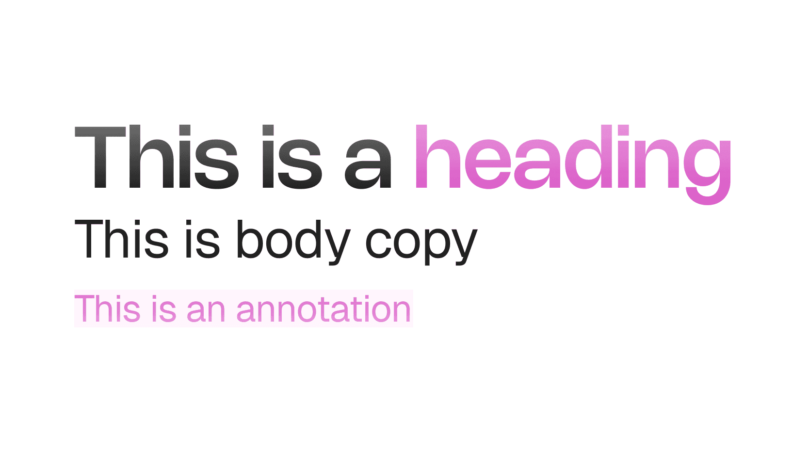
What you're creating: A legible, on-brand typographic system — one display face for headings, one clean sans-serif for labels — applied consistently across your video.
Font pairing: one display face for titles and headings (can be expressive or geometric) and one clean sans-serif for body text, labels, and callouts — if you already have brand fonts, use them consistently and avoid picking new ones
Sizes at 1080p: titles 80–120 px, chapter markers 60–80 px, on-screen labels 36–48 px
Font weight
- Use semi-bold or bold for titles and calls to action
- Use regular or medium for body labels and annotations
- Avoid condensed fonts unless space is extremely limited. They hurt legibility, especially on mobile
5.2 Colors
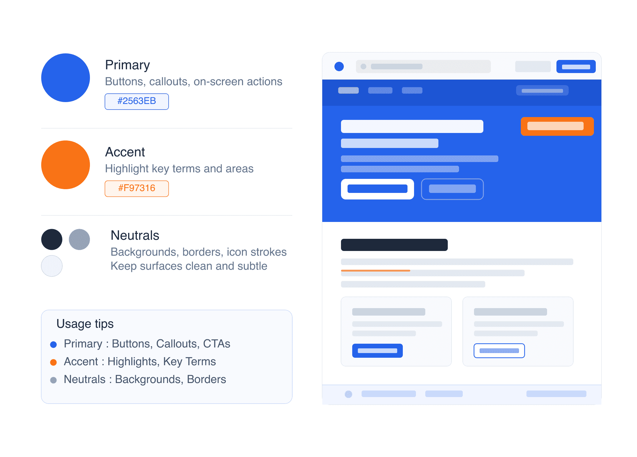
What you're creating: A minimal token set of brand colors — primary, accent, and neutrals — applied consistently with accessibility contrast in mind.
Build a minimal token set: Brand/Primary for main CTAs, highlight text, and key visuals; Brand/Accent for hover states, links, and secondary emphasis; Neutral/90 for primary text color; Neutral/10 for backgrounds or muted UI frames
Accessibility: maintain a minimum contrast ratio of 4.5:1 for text over color blocks — use light backgrounds with dark text (or vice versa), especially for smaller labels
Usage tips
- Primary: Use for buttons, callouts, on-screen actions
- Accent: Use sparingly to highlight key terms or areas
- Neutrals: Keep backgrounds clean, UI outlines subtle
5.3 Logo & Watermark
What you're creating: A consistent, non-intrusive logo placement and optional watermark that builds trust without covering content.
Logo placement
- Maintain a minimum 48 px safe area from all edges
- Never cover interface elements or step content
- Position it consistently — top-left, bottom-right, or centered on intro/outro slides
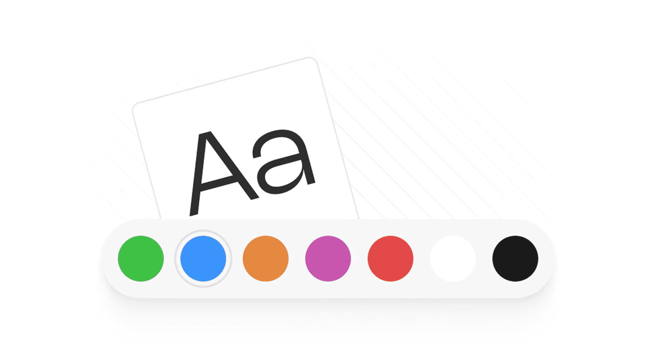
Watermarking: use a 20–30% opacity watermark in the bottom-right corner and toggle it off during dense UI shots where overlays would interfere with clicks or instructions
5.4 Applying Branding Across Videos
What you're creating: A consistent branded presence across every visual touchpoint — slides, labels, backgrounds, callouts, and thumbnails.
Apply branding consistently across: intro, chapter, and outro slides / on-screen labels and tooltips / backgrounds / callouts (arrows, highlights, buttons) / lower-thirds / PiP frames or webcam borders / thumbnails — consistent fonts, color, and spacing improve recognition