How to create a killer product walkthrough video
A video walkthrough shows someone how to complete a task, step by step. Here's how to plan, record, and ship one that viewers actually finish.
TL;DR
- A product walkthrough video is a recorded, narrated run-through of a task that shows every step in the order someone would actually do them. Video walkthrough and software walkthrough mean the same thing.
- Pick a walkthrough when the viewer needs to complete a task. Pick a demo when they need to decide whether to buy.
- One task per video. The moment you cover two, completion drops and the video expires twice as fast.
- Script before you record. Most bad walkthroughs are a recording problem downstream of a planning problem.
- Budget for the rewrite, not the recording. A walkthrough is only worth making if you can update it when the UI moves.
The 40th time you explain the same screen
Somewhere in your onboarding flow is a step that nobody gets right the first time. You know which one. It generates the same support ticket every week, and someone on your team has now walked a customer through it live enough times that they could do it with the tab closed.
That's the case for a product walkthrough video. Not because video is better than writing, but because a sequence of clicks is genuinely hard to describe in prose and genuinely easy to show.
The trouble is that most walkthroughs get made in one take and get watched only once. This is a guide to making the other kind.
What is a product walkthrough video?
A product walkthrough video is a recorded, narrated run-through of a task inside software that shows each step in the order someone would actually perform it. It's a screen recording with voiceover or captions that carries the viewer from a defined starting point to a finished task — signing up, connecting an integration, running their first report.
You'll see the same thing called a video walkthrough, a software walkthrough, or an app walkthrough video. Those are synonyms, and this guide uses them interchangeably. Two other trades borrow the word for something unrelated: real estate agents mean a filmed property tour, and gamers mean a recorded playthrough. Neither is what follows here.
Product walkthrough video vs. product demo vs. interactive tour
These three get treated as synonyms in most content, and the substitution is expensive. They serve different people at different moments.
Product demos are typically built for marketing and sales enablement; they help attract or convert users before they sign up.
Product walkthroughs, on the other hand, are for post-signup success. They're embedded directly inside your product and guide users through tasks in real time, unlocking retention.
A demo is allowed to skip the boring parts, and a walkthrough is not. A prospect watching a demo will forgive you for cutting from "upload your data" to "look at this dashboard." A user following a walkthrough will get stuck precisely in the gap you cut. If you find yourself editing out steps to keep a walkthrough tight, you've picked too big a task.
For the in-product version of this — short videos triggered inside your UI instead of tooltips — we've written separately about replacing static tooltips with product walkthrough videos.
| Video walkthrough | Product demo | Interactive tour | |
|---|---|---|---|
| The viewer's question | How do I do this? | Should we buy this? | Where do I click? |
| Who it's for | An existing user with a task in front of them | A prospect evaluating options | A new user inside the product |
| Where it lives | Help center, onboarding email, support reply | Landing page, sales follow-up | Overlaid on your live UI |
| Coverage | One task, start to finish | The value story, selectively | One flow, click by click |
| Cost to update | Re-record the changed section | Re-record and re-approve | Re-map the selectors |
| Fails when | It covers more than one task | It shows every feature | The UI shifts underneath it |
In short: Demos win sign‑ups, but walkthroughs win daily active users. While both have their place, only one helps your user succeed after they've signed up. Let’s look at what makes walkthroughs uniquely powerful - especially compared to static tooltips.
| 📖 Read more: Best Product Walkthrough Software
Why Product Walkthrough Videos Beat Static Tooltips
Videos add context and momentum, not just hints.
Tooltips have long been the default for onboarding nudges, but they are limited by design. They tend to be point-based and passive, and are often easily ignored. Product walkthrough videos, on the other hand, bring clarity, continuity, and velocity to user actions.
Let’s break it down:
- Show full context, not single UI hints – Static tips anchor to one UI element, often leaving the outcome to imagination. Screen-recorded clips can zoom out, stitch multiple steps together, and let new users preview the setup.
Stat check: 78% consumers say short video is their favorite way to learn about a product, miles ahead of text or static images.
- Guide an entire task, not isolated clicks – Tooltips are momentary. An in‑app walkthrough is sequential. For example, instead of “Upload logo here,” a video can demonstrate the full flow of the branding setup from upload to published page. That task-level clarity builds confidence and eliminates guesswork.
Stat check: Video-based onboarding improves knowledge retention by 35 % compared with text-only tips.
- Persist after onboarding – Tooltips often disappear once dismissed. But onboarding videos remain accessible, embedded in sidebars, help centers, or empty-state prompts. They’re searchable, replayable, and useful long after Day 1.
Stat check: 62% reps say video has reduced support queries because users can self-serve whenever they hit friction.
When not to make one
A walkthrough is the wrong format more often than the format's advocates admit.
Skip it when the task takes fewer than three steps. A two-step task described in a sentence beats a 40-second video that someone has to find, load, and scrub through. Skip it when the reader needs to copy something — an API key, a snippet of configuration — because you cannot copy text out of a video. Skip it when the flow changes monthly, unless you have a production process that can keep up.
And skip it when the real problem is the interface. A walkthrough that exists because a screen is confusing is a patch over a design bug, and it will need to exist forever. Worth saying out loud in the meeting where the walkthrough gets requested.
Get Started with Clueso
Create impressive walkthrough videos now!
How do you make a product walkthrough video?
Five stages, and only one of them is recording.
1. Name one task and one viewer
Write the title before anything else, as a completed action from the viewer's side: "Connect your Salesforce account," not "Integrations overview." If you can't write that sentence without an "and," split it into two videos.
Then decide who's watching, specifically. An admin setting up a workspace for 300 people and an end user finding their own dashboard need different videos about the same screen. Picking one means you get to skip the context the other one needs.
2. Write the script first
Most bad walkthroughs are planning failures that happen to be recorded. Write the narration as a numbered list of steps, out loud, before you touch a recorder. You'll find the dead ends this way — the step that assumes a permission the viewer doesn't have, the field that's only visible after saving.
Keep the narration in the imperative and put the click before the reason: "Open Settings, then Integrations. This is where every connected app lives." Reversed, the viewer is still hunting for the menu while you're explaining the concept.
3. Record in a state you control
The setup work nobody mentions is what separates a walkthrough that ages well from one that gets pulled in a month.
Use a demo account with realistic but fake data, never a live one. Real customer names in a help center video are a privacy incident waiting to be reported. Set your browser to a fixed window size and write it down, so the re-record in six months matches. Hide bookmarks, notification badges, and any panel showing a date or a version number — those are the details that date a video faster than the UI does. Record at the resolution you'll publish at, and move the cursor deliberately, pausing on each target before clicking.
Record the whole flow in one pass without stopping to fix mistakes. Cutting is cheaper than re-taking.
4. Cut hard, then label
The edit is where the walkthrough earns its completion rate. Remove every page load, every pause where you were reading your own script, every "let me just." A four-minute raw recording usually has 90 seconds of actual instruction in it.
Then make it navigable. Chapters let a viewer jump to step four when steps one through three are already done, which is how walkthroughs are actually watched the second time. Add captions — for the people watching muted in an open office, and because captioned video is text a search engine can index. If you support customers in more than one language, translated voiceover is the difference between one usable video and one video plus a support queue.
This is the stage where the tooling matters most, because it's the stage teams skip when they're busy. Clueso is built for it: you record the flow once, and it handles the transcription, the AI voiceover, the filler-word cleanup, and the translation, then publishes the same recording as a step-by-step written guide alongside the video. The written version is the one people search for and skim; the video is the one they follow. Producing both from one recording is what makes it possible for a single person to keep a library current without a video team.
5. Put it where the question gets asked
A walkthrough in a shared drive is a walkthrough nobody watches. Embed it in the help center article for that task, drop it in the onboarding email for the step it unblocks, and give your support team the link so it can be pasted into a reply. If you already run a training video library, the walkthrough should be findable by task name in it, not by video title.
How long should a product walkthrough video be?
As long as the task and no longer, which for a single software task usually lands between 45 seconds and three minutes.
Length isn't really the variable, though. Scope is. A 12-minute walkthrough is almost always four walkthroughs that were recorded in one sitting, and splitting it will improve completion more than any amount of tightening. If a task genuinely needs 10 minutes, publish it as a series with a written index.
In‑App Product Walkthrough Video Examples
When it comes to in‑app walkthrough videos, format follows function. The best product walkthrough videos are tailored to the task. Choose your format based on where the user is and what they need to do next.
Here’s a breakdown of 5 walkthrough video formats mapped to real in‑product moments:
1. Welcome Mini-Tour
📍 Placement: First-login modal
⏱ Length: 45–60 sec
🎯 Why: It’s your first impression. This in‑app walkthrough should orient new users to the key parts of your UI or guide them to their first meaningful action.
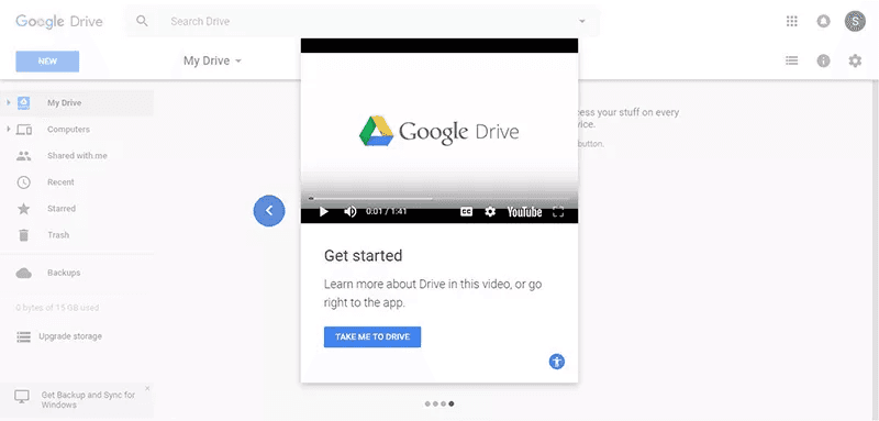
Google Drive greets new users with a short modal-based video that plays on first login. It introduces the key interface elements upfront, making it easy to move forward. Because the video is embedded in the modal, users can either watch or skip—but the CTA (“Take Me to Drive”) keeps momentum forward.
2. Task Tutorial
📍 Placement: Sidebar or slide-out panel
⏱ Length: 1–2 min
🎯 Why: These product walkthrough videos are designed to guide repeatable workflows like “setting up automations” or “exporting data.” Easily discoverable, often replayed.
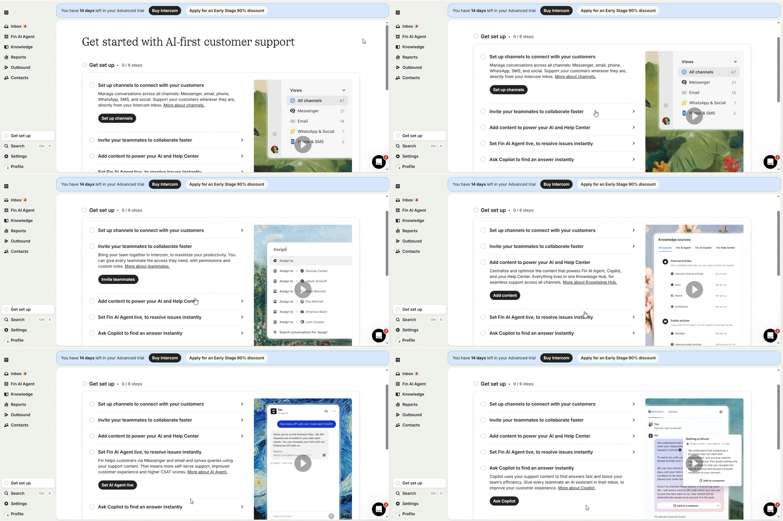
Intercom adds walkthroughs into its “Get set up” checklist. Each step has a short inline video paired with a call-to-action, embedded contextually in the sidebar. These are repeatable workflows, so users can rewatch or jump in at any point. This format turns the Help Hub into a living tutorial playlist that scales with product complexity.
3. Empty-State Explainer
📍 Placement: Blank or zero‑data states
⏱ Length: ~30 sec
🎯 Why: When a UI has no data yet, users may feel stuck. Quick onboarding videos can turn an empty screen into a launchpad by showing exactly what should happen next.
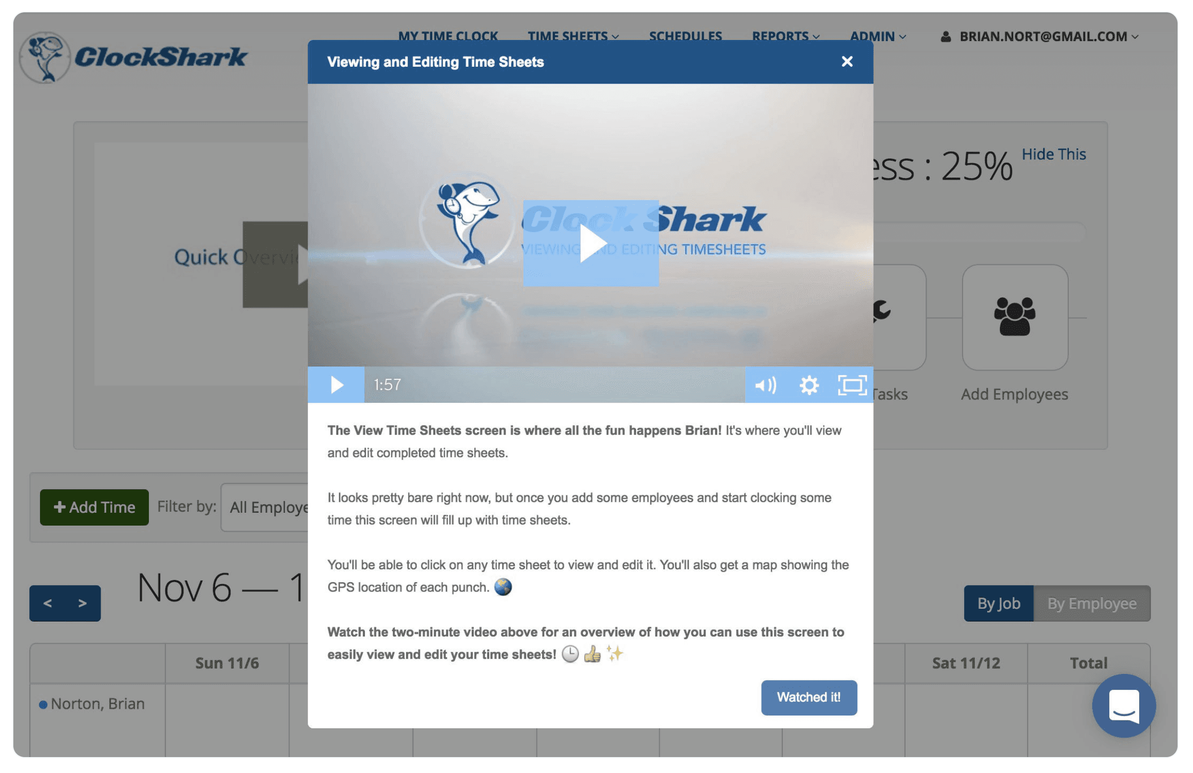
ClockShark drops a lightweight video right into its zero-data state. Instead of feeling confused about a blank Time Sheet, new users get a message informing them that the sheet will start filling out automatically as employees start clocking in. They also include an explainer video to show how to use the view and edit the sheets. With no data yet to show, the product uses the video to turn an intimidating empty screen into a confident starting point.
4. Feature Launch Clip
📍 Placement: Announcement modal or toast trigger
⏱ Length: 60–90 sec
🎯 Why: New features flop without adoption. Pairing a feature release with an in‑app walkthrough shows how it works, not just what’s new.
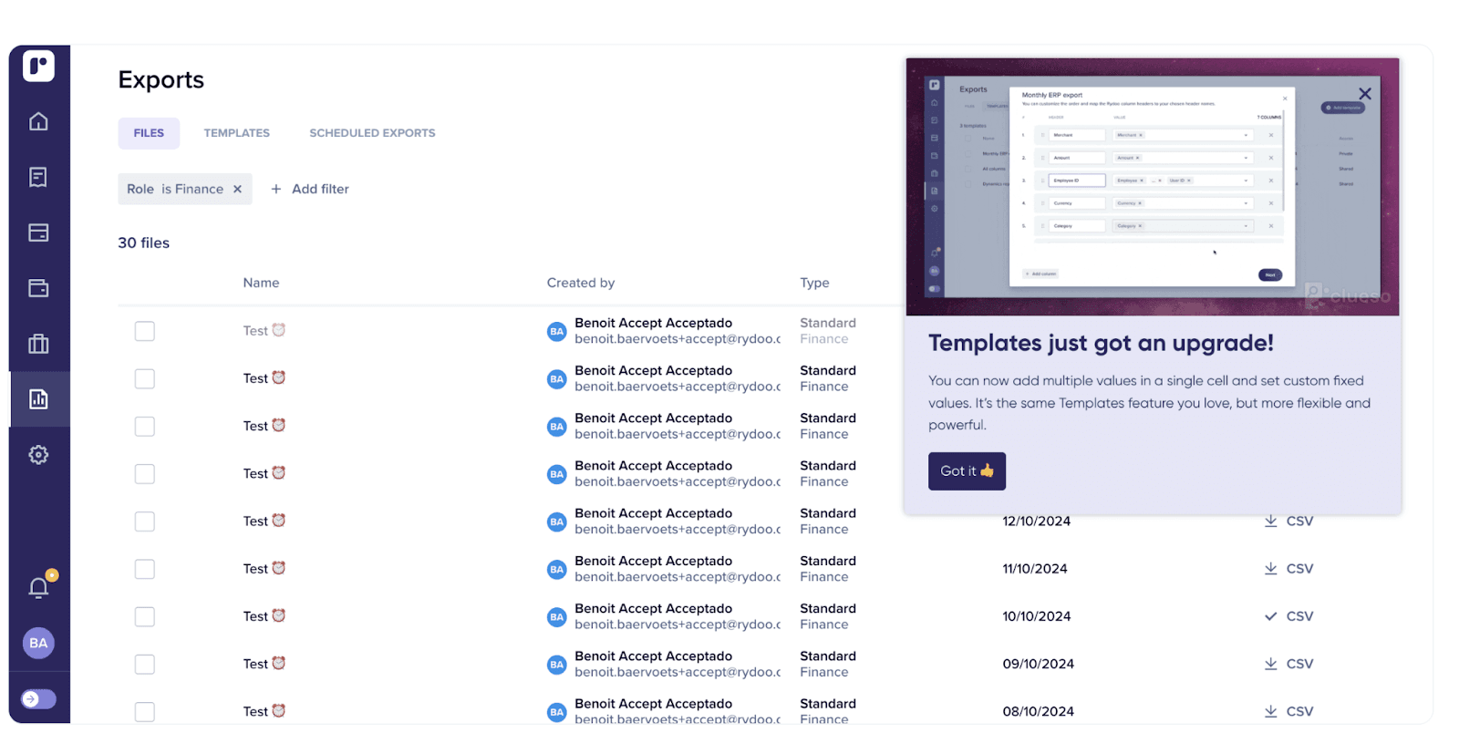
Rydoo’s Templates upgrade announcement modal uses a catchy video that shows the newly upgraded template in action and shows users how to use it.
5. Success Modal
📍 Placement: Post-task confirmation modal
⏱ Length: <30 sec
🎯 Why: After a user completes a core action (e.g. publishing a campaign), go beyond the confetti animation to reinforce success and show the next thing they can do.
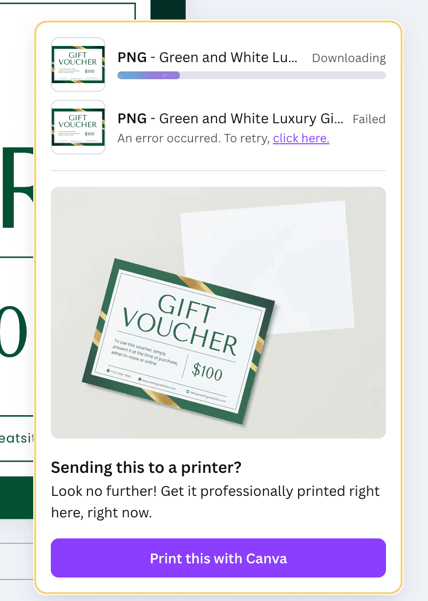
When a user moves to downloading a finished design on Canva, they get prompted to the next possible action: printing it. Canva adds a GIF of the design, depicting mock ups of prints in different sizes, subtly nudging users to print directly with them.
📌 Did you know?
You can create GIFs from videos in a jiffy on Clueso. Try it here!
Pick your video function first, then slot in the format, placement, and length that best serve that moment. Choose your format based on where the user is and what they need to do next. Relevance drives action and walkthroughs, done right, always meet the user where they are.
Get Started with Clueso
Create impressive walkthrough videos now!
Strategy & Scripting Before You Hit Record
The best product walkthrough videos are always well-planned and scripted with intention.
Pick One Persona + One Task
Trying to cover too much dilutes clarity. Choose a narrow, job-relevant use case for a specific user type and guide them through one clear, outcome-driven task.
Example:
Too broad: “Explore dashboard”
Sharper: “Set up your first team project” (for a new project manager)
This tight focus helps the video stay outcome-oriented and avoids the “demo drift” that causes user drop-off.
Define the Success Metric Before You Script
Choose a single success metric to anchor the script. This gives your onboarding videos a purpose beyond feature tour.
For example:
- Reduce the “project‑created‑but‑never‑used” rate.
- Increase the number of teammates added within the first session.
- Boost task completion within 24 hours of project creation.
This helps your video team, product team, and success team stay aligned on the why behind every second of footage.
Use the 5‑Tile Storyboard
Structure matters, especially for 90‑second product walkthrough videos. Use this five-beat flow to keep viewers engaged:
- Hook: Name the outcome - “Let’s launch your first project in 60 seconds."
- Context: Show where to start - Blank dashboard, no data yet.
- Action: Walk through the core steps - Demo clicks & inputs.
- Payoff: Reveal the result - The live project board is ready.
- Next Step: Prompt further action - “Now invite your team to collaborate.”
Script Like a Coach, Not a Narrator
Your job isn’t to explain what’s happening on the screen; it's to guide the user through it. That means writing like a coach, not a commentator. Use present tense (“Click ‘New Project’”), second person (“You’ll see a blank workspace”), and active voice (“Drag your file here”) to keep the momentum alive. Every sentence in your script should earn the next second of your user’s attention. If a phrase doesn’t teach something, set up context, or move the task forward, cut it.
Get Started with Clueso
Create impressive walkthrough videos now!
AI Workflow for Walkthrough Videos
With AI video tools like Clueso, you can turns a single screen-capture into two production-ready assets: a polished walkthrough video and a step-by-step help doc. Here’s the AI-first flow your product team will actually stick to:
Capture the task
Record your flow using Clueso’s Chrome Extension. Clueso's AI auto-tracks cursor movement and smart‑zooms on key actions as you go.Auto-generate the script
As you record, Clueso builds a script with AI from your actions. When you’re done, tweak the inline script editor to adjust phrasing or add microcopy.Swap in an AI voiceover
Choose from a library of studio-grade AI voiceovers in different tones, accents, and delivery. So no mics, no retakes, and no awkward pauses.Custom branding
Drop in your logo, brand colors, and choose lower-third templates once and Clueso automatically adds them to every video.Translate & subtitle instantly
Clueso generates accurate subtitles and can auto-translate into 37 languages. Reach every user globally without re-recording.Export dual outputs
Get a polished MP4 in‑app walkthrough and a step-by-step documentation, in Markdown or HTML, ready to drop into your support center.
One recording → two assets → zero editing headaches. It’s the fastest way to scale product education across channels; without writing extra copy, stitching tools, or waiting on a design team.
Replace Uncertainty with Clarity
The best user experiences don’t leave room for guessing. Product walkthrough videos do what static nudges can’t: they replace friction with flow. They meet users with visual clarity at the exact moment they need it.
When users know what to do and why it matters, they move faster, stay longer, and come back more often. That’s the real ROI of an in-app walkthrough: less hand-holding, more momentum. With the right walkthroughs, you reduce support tickets and increase successful outcomes.
And with Clueso, creating these onboarding videos is just as seamless. One recording gives you an in-app walkthrough and a help doc - fully branded, voiceover-ready, and translation-friendly. No editing overhead or production delays.
Start your free Clueso trial today and turn help content into high-impact video!
Frequently asked questions
What is a product walkthrough video?
A recorded, narrated run-through of a task inside software that shows each step in the order someone would perform it. It's a screen recording with voiceover or captions that takes a viewer from a starting point to a completed task.
Is a video walkthrough the same as a product walkthrough video?
In a software context, yes. Video walkthrough, software walkthrough, and app walkthrough video all describe the same format. The term also gets used in real estate for filmed property tours and in gaming for recorded playthroughs, which are unrelated.
What's the difference between a product walkthrough video and a product demo?
A walkthrough teaches an existing user to complete a task and shows every step. A demo persuades a prospect to buy and is free to skip the unglamorous parts. Using one where the other belongs is the most common mistake in product video.
How long should a product walkthrough video be?
Between 45 seconds and three minutes for a single software task. Anything past five minutes is usually several tasks that should be separate videos.
Do I need to appear on camera?
No. For software walkthroughs a screen recording with clear narration outperforms a webcam bubble, which mostly draws attention away from the interface you're pointing at. Save the on-camera format for demos and announcements.
What tools do I need to make a product walkthrough video?
A screen recorder, something to cut the recording down, and a way to add captions. Teams producing more than a handful of these usually move to a single tool that covers recording through publishing — see our comparison of product walkthrough software.
How do I keep walkthroughs from going stale?
Record in a controlled demo environment with documented window dimensions so a re-record matches the original, keep one task per video so a UI change invalidates one video instead of ten, and note the release version alongside each video so you know what to check when the product ships.
Ashish Upadhyay
Senior Content Marketing Manager
Ashish is a Senior Content Marketing Manager at Clueso with 7+ years of experience across content, product, brand marketing. Now his mission is to help product and customer education teams realize the value of video-based learning. Outside of work, Ashish sketches, sings, plays the guitar, cooks, and does all things LLMs can't yet.