
Swapping Out Boring Tooltips With Product Walkthrough Videos
Tooltips don’t teach; they just point. Learn why product walkthrough videos are a better bet, and how to deploy them.
8
min read
Jun 16, 2025
TL;DR
Product walkthrough videos play inside your product, guiding users after onboarding to repeated value — something pre‑sale demos and static tooltips can’t match.
Walkthrough videos outperform tooltips in activation and adoption by driving clarity at exactly the right moment.
This guide shows how to plan, script, and ship in-app walkthroughs faster with an AI-powered workflow.
Tooltips are ubiquitous on product UIs — those little hover bubbles that hint, nudge, or explain what a button does. They’re easy to ship and helpful to users in small doses. But when it comes to guiding users through key product moments, tooltips alone don't cut it.
Because tooltips are dismissible, forgettable, and often lack the full context a user needs to complete a task. A tooltip might say “Click here to get started”—but then what?
In-app walkthrough videos fill that gap. Instead of throwing a floating sentence at users mid-click, videos can demonstrate and explain. They show what happens after you click it, why it matters, and what to do next.
We’re not throwing out the tooltips baby with the bathwater. Tooltips still remain a crucial, non-intrusive way to help users, especially as micro-interactions. But for onboarding, feature adoption, and power workflows, product walkthrough videos provide better clarity and completion.
Product Walkthrough Videos vs. Product Demos (and Why In‑App Matters)
Product walkthrough videos are often confused with product demos. Before we dig into creation tactics, let’s separate these two often‑confused assets.
Product demos are typically built for marketing and sales enablement; they help attract or convert users before they sign up.
Product walkthroughs, on the other hand, are for post-signup success. They're embedded directly inside your product and guide users through tasks in real time, unlocking retention.
Attribute | Product Demo | Product Walkthrough Video |
|---|---|---|
Location | Marketing site, sales deck | Inside the app (modal, sidebar, empty state) |
Audience | Prospects evaluating | New & existing users already signed up |
Goal | Acquire & persuade | Activate, adopt, expand |
Content | Broad feature or product overview | Task‑based, contextual clip |
In short: Demos win sign‑ups, but walkthroughs win daily active users. While both have their place, only one helps your user succeed after they've signed up. Let’s look at what makes walkthroughs uniquely powerful - especially compared to static tooltips.
| 📖 Read more: Best Product Walkthrough Software
Get Started with Clueso
Create impressive walkthrough videos now!
Why Product Walkthrough Videos Beat Static Tooltips
Videos add context and momentum, not just hints.
Tooltips have long been the default for onboarding nudges, but they are limited by design. They tend to be point-based and passive, and are often easily ignored. Product walkthrough videos, on the other hand, bring clarity, continuity, and velocity to user actions.
Let’s break it down:
Show full context, not single UI hints – Static tips anchor to one UI element, often leaving the outcome to imagination. Screen-recorded clips can zoom out, stitch multiple steps together, and let new users preview the setup.
Stat check: 78% consumers say short video is their favorite way to learn about a product, miles ahead of text or static images.
Guide an entire task, not isolated clicks – Tooltips are momentary. An in‑app walkthrough is sequential. For example, instead of “Upload logo here,” a video can demonstrate the full flow of the branding setup from upload to published page. That task-level clarity builds confidence and eliminates guesswork.
Stat check: Video-based onboarding improves knowledge retention by 35 % compared with text-only tips.
Persist after onboarding – Tooltips often disappear once dismissed. But onboarding videos remain accessible, embedded in sidebars, help centers, or empty-state prompts. They’re searchable, replayable, and useful long after Day 1.
Stat check: 62% reps say video has reduced support queries because users can self-serve whenever they hit friction.
Get Started with Clueso
Create impressive walkthrough videos now!
Mapping In‑App Walkthrough Videos to the Post‑Onboarding Journey
In‑app walkthrough videos aren’t one‑size‑fits‑all. They should be mapped precisely to where users are in their journey. Here’s a framework that breaks down how to think about product walkthrough videos across key post‑onboarding stages:

1. First Success (Day 0–1): Welcome Modal with 60‑Second Task Video
What it does:
The user has just signed up—this is your moment to help them complete their first meaningful action. A short walkthrough triggered inside a welcome modal (e.g. “Let’s create your first project”) gives them a win immediately.
Why it works:
Modals ensures high visibility. The video lowers friction, reduces time-to-value, and gives the user confidence that they’re in the right place.
💡 Pro Tip
End the video with a direct action CTA inside the product—e.g. “Click ‘New Project’ to try it now.” This reinforces the habit with immediacy.
2. Habit Building (Week 1–4): Sidebar or Slide‑Over Panel Playlist
What it does:
After the first win, you need to build rhythm. A curated playlist of short walkthroughs can live in a slide-out panel (more accessible than a help center) or collapsible sidebar element. These cover core workflows that users will need repeatedly.
Why it works:
It’s passive guidance that users can pull when needed. The playlist format also encourages completion—users can progress through tasks at their own pace.
💡 Pro Tip
Use lightweight tracking to detect drop-offs or underused features, and dynamically reorder your playlist to surface the most relevant next task.
3. Feature Adoption: Release Banner or Toast Pop‑Up with Video
What it does:
When new features roll out, don’t just announce them—show them. Trigger a walkthrough video from a small banner or toast (e.g. “New: Automate Reports → Watch how”).
Why it works:
It's unobtrusive but timely. The video makes new features feel accessible, not intimidating. And because it’s contextual, users are more likely to engage with it immediately.
💡 Pro Tip
Autoplay the video in mute with a click-to-unmute option for maximum visual pull without disrupting the user's workflow.
4. Expansion & Advocacy: Contextual “Pro Tips” Modal or Advanced Workflow Overlay
What it does:
Target power users who’ve activated the basics but haven’t tapped into more advanced (and monetizable) functionality. Drop a “Did you know you can…” walkthrough modal that appears after a key action or milestone.
Why it works:
These users are already engaged; they don’t need a tour, they need a challenge. This unlocks higher value features and nudges them toward plan upgrades or community referrals.
💡 Pro Tip
Pair advanced walkthroughs with a visible badge or level-up cue (e.g. “Workflow Master” once completed) to reward usage and create a gamified loop.
Get Started with Clueso
Create impressive walkthrough videos now!
In‑App Walkthrough Video Formats (with SaaS Examples)
When it comes to in‑app walkthrough videos, format follows function. The best product walkthrough videos are tailored to the task. Choose your format based on where the user is and what they need to do next.
Here’s a breakdown of 5 walkthrough video formats mapped to real in‑product moments:
1. Welcome Mini-Tour
📍 Placement: First-login modal
⏱ Length: 45–60 sec
🎯 Why: It’s your first impression. This in‑app walkthrough should orient new users to the key parts of your UI or guide them to their first meaningful action.
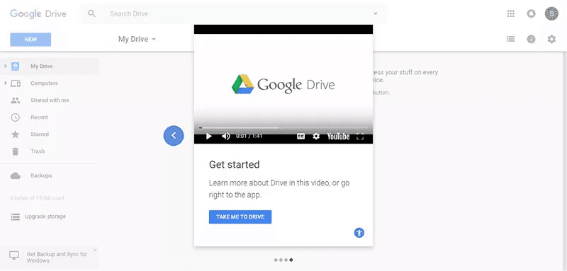
Google Drive greets new users with a short modal-based video that plays on first login. It introduces the key interface elements upfront, making it easy to move forward. Because the video is embedded in the modal, users can either watch or skip—but the CTA (“Take Me to Drive”) keeps momentum forward.
2. Task Tutorial
📍 Placement: Sidebar or slide-out panel
⏱ Length: 1–2 min
🎯 Why: These product walkthrough videos are designed to guide repeatable workflows like “setting up automations” or “exporting data.” Easily discoverable, often replayed.

Intercom adds walkthroughs into its “Get set up” checklist. Each step has a short inline video paired with a call-to-action, embedded contextually in the sidebar. These are repeatable workflows, so users can rewatch or jump in at any point. This format turns the Help Hub into a living tutorial playlist that scales with product complexity.
3. Empty-State Explainer
📍 Placement: Blank or zero‑data states
⏱ Length: ~30 sec
🎯 Why: When a UI has no data yet, users may feel stuck. Quick onboarding videos can turn an empty screen into a launchpad by showing exactly what should happen next.
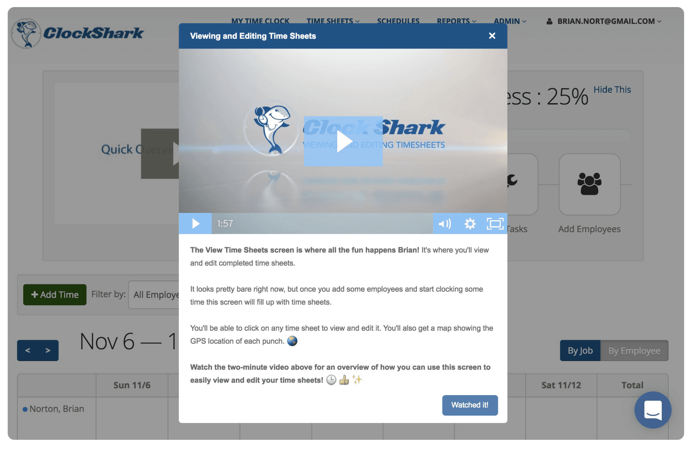
ClockShark drops a lightweight video right into its zero-data state. Instead of feeling confused about a blank Time Sheet, new users get a message informing them that the sheet will start filling out automatically as employees start clocking in. They also include an explainer video to show how to use the view and edit the sheets. With no data yet to show, the product uses the video to turn an intimidating empty screen into a confident starting point.
4. Feature Launch Clip
📍 Placement: Announcement modal or toast trigger
⏱ Length: 60–90 sec
🎯 Why: New features flop without adoption. Pairing a feature release with an in‑app walkthrough shows how it works, not just what’s new.
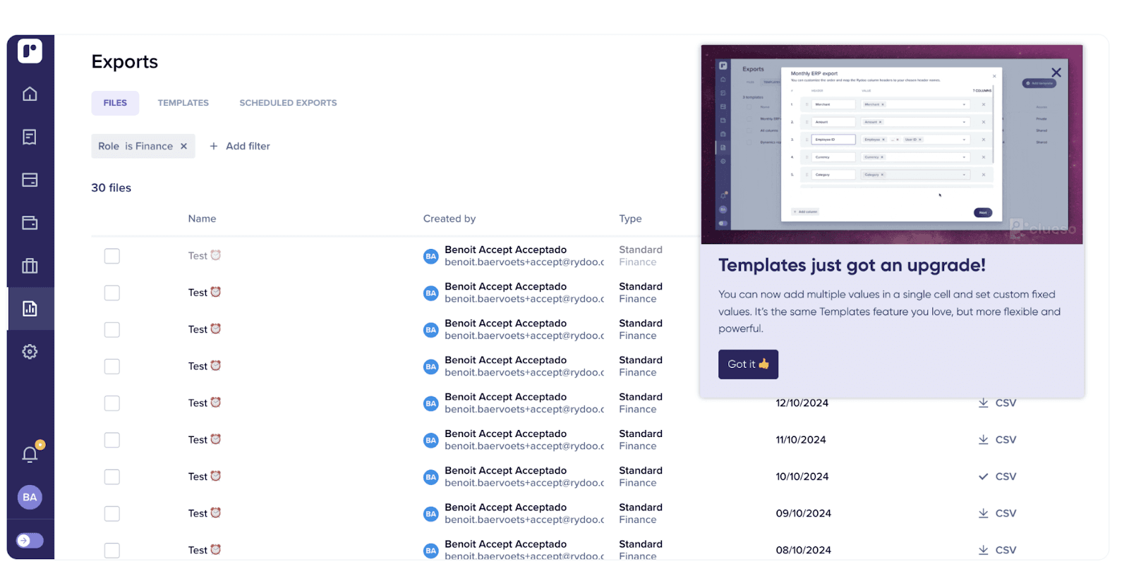
Rydoo’s Templates upgrade announcement modal uses a catchy video that shows the newly upgraded template in action and shows users how to use it.
5. Success Modal
📍 Placement: Post-task confirmation modal
⏱ Length: <30 sec
🎯 Why: After a user completes a core action (e.g. publishing a campaign), go beyond the confetti animation to reinforce success and show the next thing they can do.
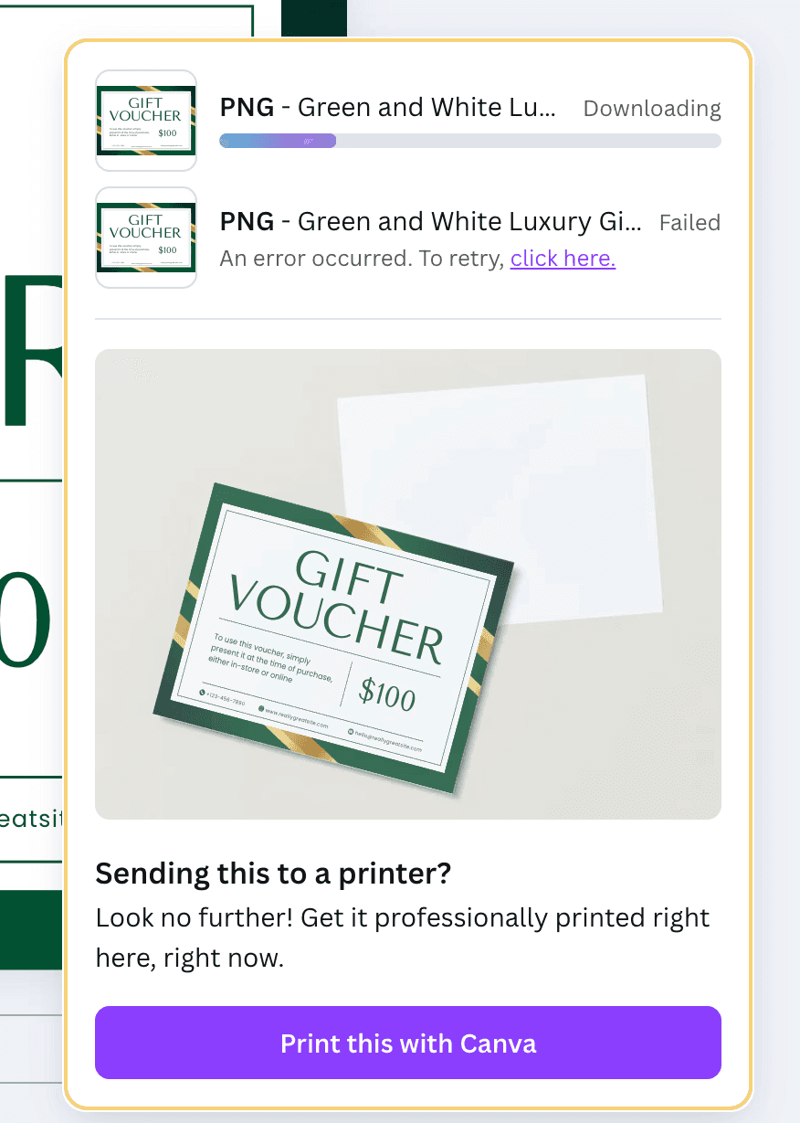
When a user moves to downloading a finished design on Canva, they get prompted to the next possible action: printing it. Canva adds a GIF of the design, depicting mock ups of prints in different sizes, subtly nudging users to print directly with them.
📌 Did you know?
You can create GIFs from videos in a jiffy on Clueso. Try it here!
Pick your video function first, then slot in the format, placement, and length that best serve that moment. Choose your format based on where the user is and what they need to do next. Relevance drives action and walkthroughs, done right, always meet the user where they are.
Strategy & Scripting Before You Hit Record
The best product walkthrough videos are always well-planned and scripted with intention.
Pick One Persona + One Task
Trying to cover too much dilutes clarity. Choose a narrow, job-relevant use case for a specific user type and guide them through one clear, outcome-driven task.
Example:
Too broad: “Explore dashboard”
Sharper: “Set up your first team project” (for a new project manager)
This tight focus helps the video stay outcome-oriented and avoids the “demo drift” that causes user drop-off.
Define the Success Metric Before You Script
Choose a single success metric to anchor the script. This gives your onboarding videos a purpose beyond feature tour.
For example:
Reduce the “project‑created‑but‑never‑used” rate.
Increase the number of teammates added within the first session.
Boost task completion within 24 hours of project creation.
This helps your video team, product team, and success team stay aligned on the why behind every second of footage.
Use the 5‑Tile Storyboard
Structure matters, especially for 90‑second product walkthrough videos. Use this five-beat flow to keep viewers engaged:
Hook: Name the outcome - “Let’s launch your first project in 60 seconds."
Context: Show where to start - Blank dashboard, no data yet.
Action: Walk through the core steps - Demo clicks & inputs.
Payoff: Reveal the result - The live project board is ready.
Next Step: Prompt further action - “Now invite your team to collaborate.”
Script Like a Coach, Not a Narrator
Your job isn’t to explain what’s happening on the screen; it's to guide the user through it. That means writing like a coach, not a commentator. Use present tense (“Click ‘New Project’”), second person (“You’ll see a blank workspace”), and active voice (“Drag your file here”) to keep the momentum alive. Every sentence in your script should earn the next second of your user’s attention. If a phrase doesn’t teach something, set up context, or move the task forward, cut it.
AI Workflow for Walkthrough Videos
With AI video tools like Clueso, you can turns a single screen-capture into two production-ready assets: a polished walkthrough video and a step-by-step help doc. Here’s the AI-first flow your product team will actually stick to:
Capture the task
Record your flow using Clueso’s Chrome Extension. Clueso's AI auto-tracks cursor movement and smart‑zooms on key actions as you go.
Auto-generate the script
As you record, Clueso builds a script with AI from your actions. When you’re done, tweak the inline script editor to adjust phrasing or add microcopy.
Swap in an AI voiceover
Choose from a library of studio-grade AI voiceovers in different tones, accents, and delivery. So no mics, no retakes, and no awkward pauses.
Custom branding
Drop in your logo, brand colors, and choose lower-third templates once and Clueso automatically adds them to every video.
Translate & subtitle instantly
Clueso generates accurate subtitles and can auto-translate into 37 languages. Reach every user globally without re-recording.
Export dual outputs
Get a polished MP4 in‑app walkthrough and a step-by-step documentation, in Markdown or HTML, ready to drop into your support center.
One recording → two assets → zero editing headaches. It’s the fastest way to scale product education across channels; without writing extra copy, stitching tools, or waiting on a design team.
Replace Uncertainty with Clarity
The best user experiences don’t leave room for guessing. Product walkthrough videos do what static nudges can’t: they replace friction with flow. They meet users with visual clarity at the exact moment they need it.
When users know what to do and why it matters, they move faster, stay longer, and come back more often. That’s the real ROI of an in-app walkthrough: less hand-holding, more momentum. With the right walkthroughs, you reduce support tickets and increase successful outcomes.
And with Clueso, creating these onboarding videos is just as seamless. One recording gives you an in-app walkthrough and a help doc - fully branded, voiceover-ready, and translation-friendly. No editing overhead or production delays.
Start your free Clueso trial today and turn help content into high-impact video!
Frequently Asked Questions About Product Walkthrough Videos
What’s the ideal length for a product walkthrough video?
Most effective walkthrough videos fall between 45 to 90 seconds. That’s long enough to demonstrate a task with context, but short enough to keep the user engaged without interrupting their flow.
Where should product walkthrough videos be placed within my app or product experience?
Product walkthrough videos work best when placed contextually—at key moments where users are likely to need guidance. Common placements include onboarding flows, empty states, feature entry points, help icons, and settings pages. The goal is to surface videos at the moment of intent, not bury them in a generic help section.
Should I use voiceovers or just captions in walkthrough videos?
Use both. Voiceovers guide attention and explain intent, while captions make the video accessible in silent autoplay or non-English environments. Clueso helps generate both with no extra work.
Do walkthrough videos slow down the app experience?
Not if implemented right. Use lightweight MP4s hosted on a fast CDN and lazy-load them only when needed. Done this way, walkthroughs won’t affect app speed or performance scores.
How often should I update my walkthrough videos?
Any time your product’s UI or core flows change, the walkthrough should reflect that. With Clueso, updates take just minutes—no re-recording or re-editing needed.

Content Writer
Pallavi is a seasoned marketer and content strategist, having previously led content teams at VC-backed B2B SaaS startups, including her own. She now advises B2B product companies on creating stand-out content for greater brand awareness.
