
How to Make Tasteful Screen-Recorded Videos
Most video tools hand you the features; they don’t teach you taste. This is a crash course for anyone making screen recorded videos without a production crew..
TL;DR
Taste beats tech. Clarity comes from clean setups, tight scripts, and calm pacing.
Structure is everything. Use a simple format: Hook → Steps → Result → CTA.
Polish with purpose. Brand consistently, edit with restraint, and make videos accessible.
Let's be real: most people tasked with creating videos at work aren’t trained video editors. But the expectation is that your screen recordings should look clean, sound clear, and hold attention.
Even with AI tools in the mix, making something truly helpful - and watchable - still feels harder than it should. It’s not about the professional gear, or finding the “perfect” tool. It’s about taste — knowing what to keep, what to cut, and how to guide someone through a task without distracting them. Because without it, screen recordings usually fall into two extremes:
The painfully raw: chaotic desktops, jittery cursors, awkward pauses.
Or the overproduced: animated swooshes, cinematic soundtracks, and too much going on.
Neither approach actually works. The first leaves your audience confused; the second overwhelms them. This blog is your playbook for finding the balance: making screen-capture videos that look clean, feel intentional, and actually help people.
Let’s First Understand What a Tasteful Screen-Recorded Video Is
A tasteful screen-recorded video is designed to feel effortless to watch.
Nothing on screen is accidental. There’s no cluttered desktop, no frantic cursor. The narration explains why something is happening. And the video stays focused on a single goal from start to finish.
At its core, a tasteful screen-recorded video:
Solves one clear problem
Keeps the screen clean and distraction-free
Uses highlights, zooms, or callouts only when they add clarity
Respects the viewer’s time
Let’s break down what it takes: from setup to script to final polish.
Setting up & Screen-Recording
Goal: Capture the cleanest possible base because everything downstream depends on this.
Every tasteful screen-recorded video starts with a solid base. If your raw footage is clunky or chaotic, no amount of editing will save it. This is the initial phase where you control the visuals, the audio, and the environment before you ever hit “record.” Everything downstream, from pacing to polish, depends on what you do at this stage. Here's everything you need to factor in to get this part right:
Resolution & frame rate
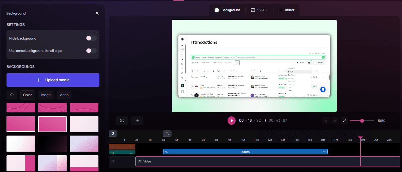
Resolution: Record at the highest your display and tool will allow. Many off-the-shelf recorders max out at 1080p, which can look fuzzy on modern screens. Tools like Clueso support crisp 2K capture, while QuickTime can go all the way to 4K if your monitor supports it.
Capture at a 1:1 pixel ratio: Avoid zoom scaling. If you’re on a Retina or HiDPI display, use 100% zoom or record from an external 1:1 monitor to avoid blur.
Frame Rate: 30 fps works for most tutorials. Bump up to 60 fps if you’ll be doing fast scrolling, drag-and-drop, or anything with rapid cursor movements.
Canvas hygiene
Clean your desktop: Use a neutral wallpaper. Hide all icons and files.
Silence distractions: Turn on Do Not Disturb, quit Slack, close background tabs, and kill CPU-heavy apps that can cause lag or fan noise.
Zoom the UI: Set app or system zoom to 110–125%. This makes text readable on smaller screens without viewers having to squint.
Cursor discipline:
Use the default cursor size.
Only enable click highlights when they serve a purpose.
Keep the cursor still when not acting. A jittery pointer creates visual noise and mental friction.
Disable trails, sparkles, or "fun" effects — they age badly and distract quickly.
| 📖 Read more: Best Screen Recording Software
The “Ugly Cursor” trick
Creators often try to make their cursor as invisible as possible - small, smooth, and fast. In screen captures, that’s a mistake. Viewers can’t follow micro-movements. A better approach to screen video capture is the so-called Ugly Cursor Trick:
Move slower than feels natural.
Pause deliberately before and after clicks.
Use a slightly bigger cursor size for easy spotting.
It might feel clunky while recording, but it’s far more legible to your viewers; especially on mobile.
💡 Pro Tip:
With Clueso, you can customize the color of your click highlights to match your brand palette.
Audio capture
Split your audio tracks if your tool supports it. Record mic input and system audio separately. This gives you flexibility in post-production to fix levels or reduce background noise.
Mic settings:
Sample rate: 48 kHz
Input gain: Peaks should hit -12 to -6 dBFS. Anything higher and you risk clipping.
If you’re not using a proper mic, at least avoid recording from a laptop speaker next to a whirring fan.
Always run a quick 10-second test recording: talk, click, scroll, then check sync and levels before committing to a full take.
Security & privacy
Blur or hide any personally identifiable info: names, emails, customer IDs, API keys.
Use demo or staging environments when possible.
Turn off browser extensions that might inject overlays (like password managers or ad blockers). These sneak into more recordings than you'd think.
A clean setup makes editing easier. Besides, nobody wants to learn from a cluttered, distracting, or unsecured video.
| 📖 Read more: Best Screen Capture Software
Get Started with Clueso
Turn every screen recording into a studio-style video.
Writing a Tight Script
Goal: Deliver one clear outcome fast, using a simple, spoken structure.
The best screen video captures aren’t long-winded tours; they’re short, clear, and to the point. Viewers don’t want to hear you think out loud or explain every menu item. They want one clear job to be done, taught quickly. The solution is a short, purposeful script that prioritizes clarity. Here's how to get to that:
Focus on one outcome
Before writing anything, define the goal of your video in one sentence: What will the viewer be able to do by the end of this video?
If you try to teach too much, you’ll lose everyone. Instead, break big topics into separate videos - one job per video.
Follow rules of 'Spoken Guidance'
Use spoken English. Short, punchy sentences. Drop the jargon. If it sounds weird out loud, cut it.
Front-load with verbs. Tell people what to do first.
✅ “Click Start”
❌ “You’ll want to go ahead and start by clicking…”
Don’t make viewers remember vague advice; give them clear value.
✅ “Set the zoom to 125%”
❌ “Make it a bit larger.”
Sample storyboard for a how-to or tutorial video (2–4 min)
Use this plug-and-play structure for fast scripting.
Hook (0–5s): Grab attention with the outcome, not the process.
Example: “Make clean screen captures that look pro — no fancy gear.”
Prereqs (5–15s): Mention tools, files, or settings you’ll need. Keep it moving.
Steps (core): Teach 3–5 actions.
Each should follow a verb → result pattern and last no more than 30–40 seconds.Example: “Drag to crop the recording area.”
Result (10s): Show the finished product. Let the viewer see what success looks like.
CTA (5–10s): Close with one clear action:
Try a template
Watch the next video
Read linked docs
You can adapt this framework for walkthroughs, how-tos, bug reports, or internal demos. It forces brevity and clarity, and makes your screen-recorded videos feel thoughtful without being overproduced.
Get Started with Clueso
Turn every screen recording into a studio-style video.
Writing AI-Assisted Scripts
Goal: Use AI to draft tight, on-brand scripts fast, freeing creators to focus on creativity and delivery.
Writing a tight, on-brand script can take longer than recording the screen video capture itself. But AI can help you script faster. Instead of spending 45 minutes fiddling with step phrasing and filler lines, you can let AI handle the scaffolding, then you bring the nuance, flow, and flavor.
A common fear is that AI will make scripts bland or cookie-cutter. In reality, AI handles the functional phrasing so you can save your creative energy for the parts that matter. AI helps you:
Get to a first draft in minutes
Stay consistent with tone and structure
Focus on voiceover delivery and visuals, not sentence math
The trick is not just prompting AI to "write a script", it’s giving it the right bones to build on. Here are some best practices and templates you can use for this:
Workflow for AI script drafting
Step 1: Outline First: Don’t start with a blank page. Sketch the beats:
hook → prereqs → 3–5 steps → result → CTA.
Step 2: Prompt with Context: AI needs more than just “make it snappy.” It needs the audience, purpose, tools, and constraints. Here's what to include:
Audience & skill level (e.g., beginner marketers, intermediate designers)
Desired outcome (e.g., “record a clean 2K screen capture”)
Time limit (e.g., “under 4 minutes”)
Toolchain (Clueso, QuickTime, Final Cut, etc.)
Brand voice (e.g., calm, helpful, precise — avoid hype or filler)
Constraints:
Spoken English only
Sentences under 10–12 words
Steps should include exact numbers
On-screen callouts ≤6 words
Step 3: Generate → critique → regenerate: Ask for 2–3 versions. Read them aloud. Choose the clearest and tighten as needed. Don’t be afraid to mix and match lines across drafts.
Drop-in prompt template
Use this prompt as a template to create your own.
Prompt: You are writing a 2–4 minute screen-capture tutorial.
Audience: [beginner/intermediate]
Outcome: [what viewers will achieve]
Tools: [recorder/editor/tools]
Constraints: short spoken sentences; show 3–5 steps; include exact numbers (UI zoom 125%, bitrate 18–24 Mbps); avoid filler; callouts ≤6 words.
Tone: [calm/assured/helpful]; avoid hype.
Output: script with timestamps (mm:ss), VO lines, on-screen labels, and chapter titles.
Human quality check
After AI gives you a script, run through it to finesse it further:
Read it out loud. You’ll catch robotic phrasing fast.
Trim redundancies. Especially repeated verbs or obvious transitions.
Add one line per step that answers “Why this?”
Example: “Set zoom to 125% — it’s the sweet spot for mobile readability.”
Say your numbers out loud so viewers don’t have to squint. Instead of “UI Zoom: 125%” on screen, say this in voiceover: “Set your UI zoom to one-twenty-five percent.”
AI accelerates scriptwriting so that you spend less time sweating commas.
💡 Pro Tip:
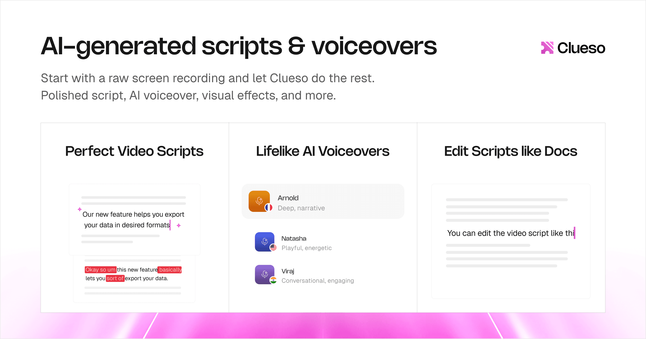
Clueso’s AI-powered scripting helps you turn your raw narration into a perfect video script. It fixes pacing, grammar, and clarity while keeping the spirit of your delivery. You’ll get an editable transcript of your audio you can refine on the spot without breaking audio–video sync. Clueso also lets you create and save AI prompts presets right inside the tool, so every future script starts in your brand voice.
Get Started with Clueso
Turn every screen recording into a studio-style video.
Recording Voiceovers
Goal: Ensure audio matches the quality of the visuals — clear, consistent, and pleasant to listen to.
A crisp screen recording with muddy audio kills the experience. Your voiceover is the human anchor of your tutorial, so capturing it cleanly is non-negotiable. Here's how:
Mic & room setup
Mic choice: USB dynamic mics like the Shure MV7 or Samsung Q2U are excellent for untreated rooms. They naturally reject background noise and don’t pick up every echo like cheap condenser mics do, making them perfect for home setups.
Mic distance: Stay 10–12 cm away from the mic. Use a pop filter. Pro tip - speak past the mic, not directly at it. This reduces plosives on harsh “p” and “b” sounds.
Room treatment: Hard walls bounce sound. Face a closet, hang a blanket, or record in a space with soft surfaces such as carpeted rooms to cut reflections. Even DIY treatment makes a huge difference.
Performance & delivery
Check for problem sounds: Say a few “p” and “b” words (plosives), and “s” and “sh” words (sibilance). If they distort, adjust your mic angle or distance.
Delivery tips:
Smile; it subtly lifts your tone.
Speak at a natural 140–160 words per minute.
After big on-screen actions (clicks, changes), pause for 0.5 to 1 second. That beat gives viewers time to catch up and makes edits smoother later.
Using AI Voiceovers
Goal: Make AI-generated narration sound natural, trustworthy, and on-brand without drifting into robotic or distracting.
AI-generated voiceovers have come a long way - natural pacing, expressive tone, even subtle warmth. But tasteful AI voiceovers still takes craftsmanship. The secret lies in how you direct it.
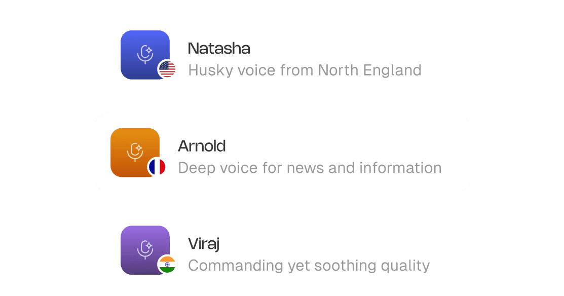
Voice selection
Pick a voice that mirrors your brand personality. For most tutorials, that means calm, clear, and neutrally warm.
Avoid voices that sound like:
Overly polished news anchors
Cartoon mascots
Hyper-casual YouTubers
A great AI voice should feel steady, human, and… forgettable in the best way. You want the message to stand out, not the voice itself.
Tone variation
Don’t use one flat tone for everything. Vary the delivery style based on what’s happening in the screen recording. Here's a simple breakdown:
Section | Speed | Pitch | Notes |
|---|---|---|---|
Hook | +5–8% | Slightly ↑ | Adds energy to pull viewers in |
Steps | Neutral | Neutral | Emphasize action verbs |
Warnings | −10% | Slightly ↓ | Slower, serious, more pause |
CTA | Hook-like | Reset ↑ | Crisp, confident close |
This variation keeps the voiceover feeling dynamic and intentional.
Directing the delivery
Most AI voiceover tools support SSML-style (Speech Synthesis Markup Language) controls. It is a standard way to control how text is spoken — adjusting pitch, speed, pauses, emphasis, and pronunciation. While not every tool shows you raw tags, many still offer these controls under simpler names like “Add pause” or “Change pronunciation”. Use them:
Emphasis: Add <emphasis> or bold important verbs and nouns.
Pauses: Insert <break time="500ms"> after big clicks, UI transitions, or to mark new steps.
Adjust pitch/speed: maps to SSML’s
pitch,rate, orvolumeattributesPronunciation: Add phonetic cues for tricky brand names or keyboard shortcuts.
Example:
“Clueso” → kloo-zoh
“Cmd+Shift+5” → Command Shift Five
If your tool doesn’t support SSML, break up the text into short, clear sentences in your script so the AI handles pacing naturally.
📌 Upgrade Your Voiceovers with Clueso
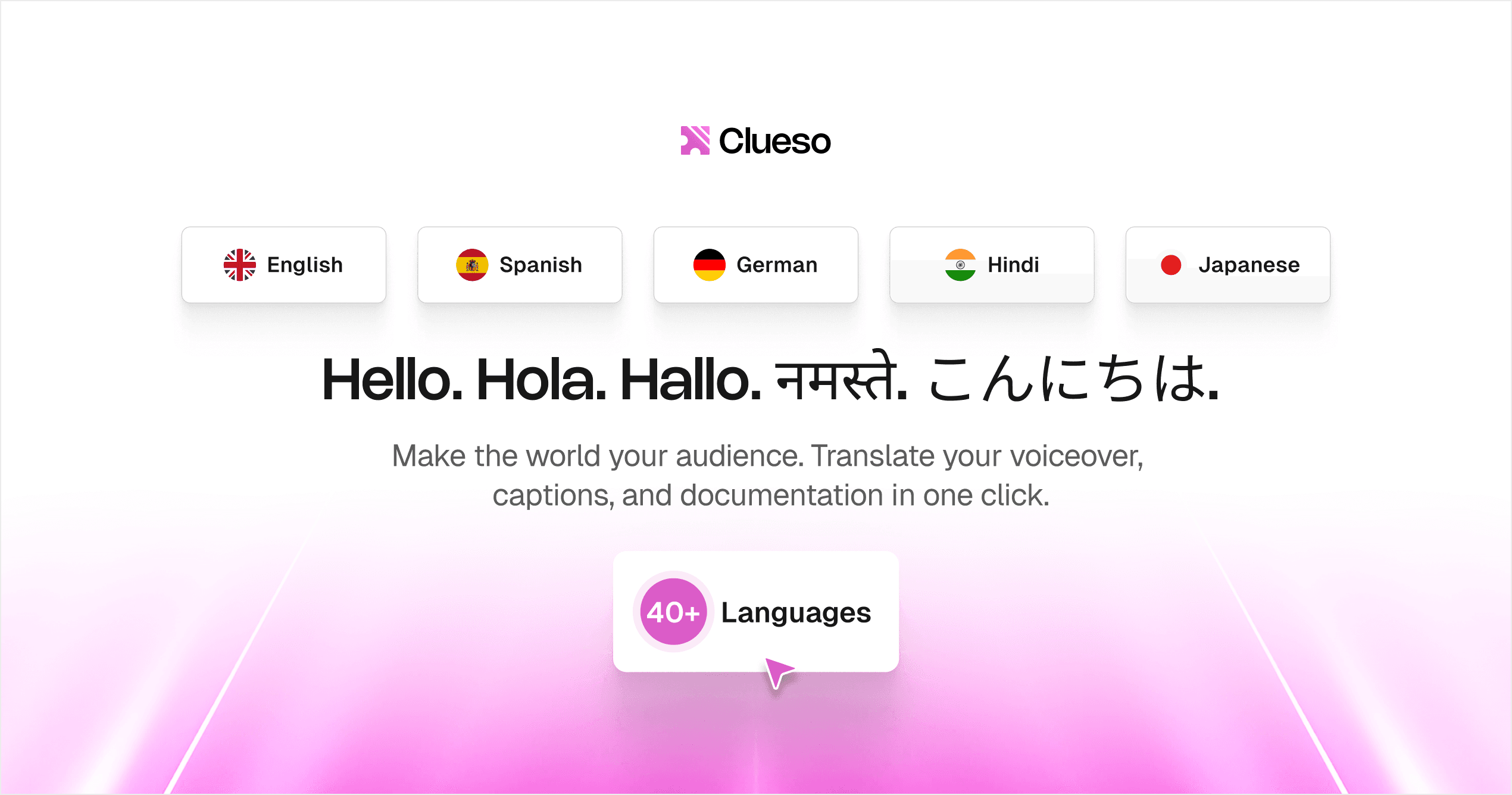
Swap your own narration for professional-grade AI voiceovers in 40+ languages and diverse accents, right inside Clueso. The variety of tone and voice pace gives you options to choose from. You can also train the AI to pronounce tricky words perfectly and never worry about mispronunciations again.
Mixing AI + human voiceovers
Mixing human and AI can work, but don’t alternate line-by-line; it’s jarring. The trick is consistency within each section:
✅ What works:
Human VO for intro + result
AI VO for steps
❌ Avoid:
Alternating every other sentence or step
Mixing within the same paragraph
Switching too frequently also confuses viewers, especially in educational content where clarity is top priority.
Running final quality checks
Always QC your AI VO before publishing:
Listen through laptop speakers and earbuds, not just system monitors.
Watch ut for:
Harsh sibilance (add a light de-esser to tame harsh “s/sh” sounds.)
Audible breaths between lines
Room tone mismatches (if mixing with human VO)
Use light compression if your AI tool doesn't already apply it
Adding Branding (Fonts, colors, logo)
Goal: Build trust and recognition with subtle, consistent branding that supports (but never overwhelms) the content.
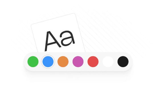
Tasteful screen recorded videos reflect your brand’s tone and aesthetic. But branding doesn’t mean slapping your logo on everything. Instead, think of branding as visual consistency: font choices, color hierarchy, and logo placement that quietly reinforce your identity without pulling focus.
Fonts
Here’s how to brand your text and keep it legible across devices.
Font pairing:
One display face for titles and headings (can be expressive or geometric)
One clean sans-serif for body text, labels, and callouts
Sizes @1080p:
Titles: 80–120 px
Chapter markers: 60–80 px
On-screen labels: 36–48 px
Font weight:
Use semi-bold or bold for titles and calls to action
Use regular or medium for body labels and annotations
Avoid condensed fonts unless space is extremely limited. They hurt legibility, especially on mobile
Colors
Creating a small token set of brand colors will keep your visuals tight and usable across tools.
Minimal token set:
Brand/Primary: Main CTA, highlight text, key visuals
Brand/Accent: Hover states, links, secondary emphasis
Neutral/90: Primary text color
Neutral/10: Backgrounds or muted UI frames
Accessibility:
Make sure text over color blocks maintains a minimum contrast ratio of 4.5:1
Use light backgrounds and dark text (or vice versa) to maintain readability — especially in smaller labels
Usage tips:
Primary: Use for buttons, callouts, on-screen actions
Accent: Use sparingly to highlight key terms or areas
Neutrals: Keep backgrounds clean, UI outlines subtle
Logo & watermark
A logo can build trust - but if it’s overused or misaligned, it just gets in the way.
Logo placement:
Maintain a minimum 48 px safe area from all edges
Never cover interface elements or step content
Position it consistently — top-left, bottom-right, or centered on intro/outro slides
Watermarking (optional):
Use a 20–30% opacity watermark in the bottom-right corner
Toggle it off during dense UI shots where overlays would interfere with clicks or instructions
Applying branding across videos
Consistency is what ties the whole video together. Branding should be visible across all touchpoints of the video:
Slides: intro, chapter, outro
On-screen labels and tooltips
Backgrounds
Callouts (arrows, highlights, buttons)
Lower-thirds (if adding names or commentary)
PiP frames or webcam borders
Thumbnails: consistent fonts, color, and spacing improve recognition
Branding should be quiet but memorable. It reassures your audience that the tutorial is polished, official, and trustworthy
💡 Pro Tip:
You can brand your videos effortlessly with Clueso. Drop in your fonts, colors, and logos once and apply them to every video. You can also add custom design elements like branded intros, outros, and backgrounds.
Using Picture-in-Picture (PiP)
Goal: Add a human presence when it adds clarity or trust, while staying out of the way during dense UI steps.
Tasteful screen recorded videos use PiP strategically. Used well, PiP adds warmth and personality. Used poorly, it’s a floating distraction. Here’s how to do it right:
When to use PiP
You don’t need to be in the frame the whole time. Use PiP to add:
Human presence: Let viewers see the person behind the voice.
Quick reactions: Smile, nod, or react naturally to keep energy up.
Demonstration of physical inputs: like keyboard shortcuts, mobile gestures, or multi-device setups
Here are some video creation tips for PiP —
Framing & scale
Size: Aim for 18–28% of the screen width at 1080p
Placement:
Default to bottom-right, but move it dynamically if it blocks key content
If your platform supports “smart PiP,” consider auto-hiding during active steps
Never cover the subject UI — especially buttons, tooltips, pop-ups, or labels
Eye-line:
Eyes should sit in the upper third of the PiP frame
If possible, look toward the interface — it subconsciously cues the viewer where to focus.

Visual treatment
Shape: Rounded rectangle or circle — match your brand’s radius (e.g., 12–16 px)
Edge: Use a 2–4 px border or a soft shadow to visually separate it from the screen
Background:
Use a clean, neutral wall or soft background blur
Avoid clutter or deep contrast that pulls focus
Skip greenscreen unless you’re really good at keying
Lighting: Even, soft lighting is key. Ring lights still work, just keep the color temperature consistent.
Audio
If PiP is silent (voiceover only), mute your camera mic to avoid ambient noise leaks.
If speaking live on camera:
Use headphones or good echo cancellation
Set your mic gain once and stick with it.
Timing
Use PiP intentionally. Use where it adds value, and hide it when it doesn’t:
Use PiP During… | Hide PiP During… |
|---|---|
Intro or hook | Dense UI walkthroughs |
Transitions between steps | When showing fine cursor work |
Emphasis or reactions | When screen real estate is tight |
CTAs or end slide delivery | Fast or technical sequences |
This ebb and flow makes your screen video capture feel polished, not performative. When used with purpose, PiP makes screen-capture videos feel less like a tool demo and more like a guided experience.
Doing the Basic Edit
Goal: Trim clutter, maintain rhythm, and keep the viewer focused on one clear action per cut.
Editing a screen-recorded video is all about precision and restraint. The goal is cutting down the clutter, keeping the pace, and guiding the viewer’s eye.
We have put together a list of video editing tips -
Creating a rough cut
Start with a ruthless pass.
Remove false starts, hesitations, and dead air.
Cut out UI loading waits or idle mouse wandering.
Stick to one action per shot. Every cut should clearly answer: what changed on screen?
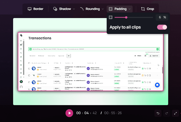
Using padding
Add a soft background and padding layer around your screen video capture, especially if you're recording at a fixed region or window size.
Recommended: 6% padding on all sides
This protects your content from being cropped by video players, platform previews, or responsive layouts
It also gives breathing room for callouts, subtitles, and PiP frames

💡 Pro Tip:
Clueso ensures consistent padding across all your clips.
Adding backgrounds
If you’re adding a background behind padded footage, use a brand color, but keep it clean:
Choose mid-tone or desaturated versions of your palette to avoid clashing with the UI
Avoid bright backgrounds that compete with the focal content
Gradients, soft textures, or blurred screenshots can help — as long as they stay low-contrast
A consistent background becomes part of your visual signature, especially in a video grid.

💡 Pro Tip:
Clueso gives you multiple background designs to choose from. You can also upload your own backgrounds, both static and dynamic.
Pacing
Tutorials live or die on flow. Good screen tutorials feel brisk, not rushed. Use timing intentionally:
Tighten dead air using ripple deletes (auto-closing gaps)
Leave 250–400 ms of space after clicks or key moments before zooms, highlights, or overlays. This gives viewers a beat to process before you move on
Use J-cuts and L-cuts for smoother momentum, especially in step transitions:
J-cut: Start the voiceover before the visual changes
L-cut: Let the video linger after the voiceover wraps
Continuity & clarity
Trim micro-movements. If the cursor drifts slightly between clicks, cut those frames.
Use freeze frames (0.5–1.0 seconds) on screens with dense info — like settings menus or export panels. It gives viewers time to read without needing to pause the video.
Adding text & labels
On-screen text should support the voiceover:
≤ 6 words per label
Sentence case (not all caps)
High contrast (e.g., white text on dark semi-transparent background)
Avoid uppercase blocks — they’re harder to read, especially on mobile
Use labels to:
Reinforce settings
Highlight actions
Call attention subtly
And place them consistently — same font, same size, same area of the screen.
Adding Visual Effects
Goal: Use zooms, highlights, and callouts to guide the eye — subtly, consistently, and only when needed.
Once your rough cut is locked, it's time to add visual polish.The rule of thumb: subtle, consistent, purposeful. They guide the eye and create flow without calling attention to themselves.
Here are some editing tips to use visual effects in your screen video capture:
Zooms & pans
Use 5–10% push-ins to emphasize an element — like a button, label, or setting
Avoid zooming in more than 15%, unless you’re showing tiny UI (e.g., a tiny gear icon or dropdown)
Anchor zooms to the element of focus, not the dead center of the screen.
Add soft ease-ins and outs (120–200 ms) so your zooms feel natural, not abrupt
💡 Pro Tip
With Custom Zoom in Clueso, you can add subtle, precise zooms that draw the viewer’s eye exactly where you want it. Highlight buttons, menus, or key actions as needed.
Highlights
You don’t need highlighter yellow or pulsing rings to point something out. Use light, clean cues.
Use soft rectangles or semi-transparent masks to spotlight areas
Click highlights:
A subtle 200–300 ms pulse at low opacity is enough to signal interaction
Avoid exaggerated ripple effects unless part of your brand look
💡 Pro Tip:
Clueso lets you highlight sections of your UI with rectangles and arrows. You can also use In the Spotlight feature to fade out the rest of the screen and keep just one element in focus.

Callouts
Use a single style for all callouts to keep consistency:
Match your brand’s primary color, corner radius, and drop shadow
Keep fonts legible, and sentence case only
Position callouts outside the focal area
Use a subtle leader line (thin, soft color) to point
Never cover the UI you’re explaining — let the interface breathe
💡 Pro Tip:
To draw instant attention to a setting, shortcut, or button, you can use callouts in Clueso.
Blur/redaction
Protect sensitive data with Gaussian blur or pixelation, depending on what blends best with your UI
Apply the same style across all shots for consistency. A sudden switch between blur types looks sloppy.
💡 Pro Tip:
Clueso lets you keep your recordings secure with blur effects. You can instantly blur out emails, API keys, order numbers, or anything you don’t want visible.
Shortcuts & keystrokes
Don’t show every keypress. Show only what helps someone do the task better.
Only show overlays for recommended paths, not every possible option.
Place overlays in the bottom-left corner, away from the main action.
Keep them short — 2–3 seconds on screen, then auto-hide
Use clean, legible fonts; sentence case or proper casing (e.g., “Cmd + Shift + 5”)
Visual Framing & Engagement
Goal: Guide attention, reinforce clarity, and drive action through thoughtful visual structure and surface-level design.
Once your screen-capture video is recorded, voiced, and edited, the final layer is framing the experience so it’s easy to follow, easy to act on, and visually on-brand.
This layer includes your intro and chapter slides, end screens, thumbnails, titles, and CTAs — all the elements that tell your viewer what they’re about to learn, where they are, and what to do next.
Here’s how to build it tastefully:
Structuring slides (intro, chapters, outro)
A tasteful screen-recorded video is about how you move through it. Slides frame the content, reset attention, and guide viewers from start to finish.
Intro slides set the tone. Chapter markers create breathing room. And the outro slide lets you close with confidence and a clear next step. Here’s how to structure them cleanly:
Intro slide
In the first few seconds, viewers want to know: “What am I going to get?”
Focus on the outcome
Example: “Record crisp 2K screen captures in under 3 minutes.”
Slide elements:
Title: 10 words max.
Logo: Small, bottom or corner placement
Background: Subtle - gradients or a blurred product shot
Avoid: Busy UIs, distracting animations
Motion guidelines:
Use a soft 10-15% scale-in or a subtle wipe
Keep transitions short - a soft wipe with ≤0.3s easing
Accessibility tips:
Font size: 64–80px minimum at 1080p
Contrast: High — light text on dark or vice versa for readability
Safe margins: Keep text away from edges (10–12% padding)
Examples:
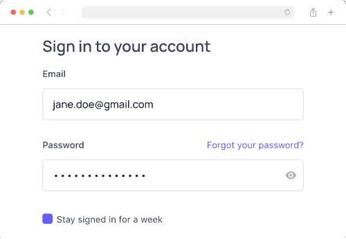
a. Bad Intro Slide Example

What is not working:
Distracting animations
Different font styles and sizes
Lack of alignment
Use of long sentences
Part of the text is too small to read
b. Good Intro Slide Example

Chapter slides
Chapters keep rhythm and help your viewer breathe between steps.The slides break your video into clean, digestible chunks. They are helpful for both human viewers and algorithmic navigation (e.g., YouTube chapters).
Slide elements:
Text format: Numbered step + clear label
E.g.,
02 Write a Tight ScriptPlacement: Same position across all chapters (e.g., bottom-left)
Background: Light blur or neutral tone to maintain visual separation
Avoid: Extra icons or clutter
Motion guidelines:
Keep intro visible for 5-10 seconds
Short, consistent transition in/out, such as quick fade, slide, or wipe (≤0.3s)
No exaggerated zooms or complex transitions
Accessibility tips:
Font size: 60–80px minimum @1080p
Contrast: Ensure readability on all backgrounds
Consistency: Do not shuffle layout between chapters
Best practices:
Limit to 3–5 chapters
Keep each on screen 0.5–1.5 seconds — just long enough to register
Use same font size, color, and position across slides
Rounded corners? Stick with one radius
Tip: Mirror your chapter titles in your YouTube description timestamps. This enables jump navigation and improves watch time.
Examples:
a. Bad Chapter Slide Example


What is not working
Busy background creates visual clutter
Lacks consistent layout
b. Good Chapter Slide Example
Outro slide
The final slide is a soft close plus a next step. Wrap it in one line, then give viewers a clear direction.
Slide elements:
Recap title: Clear, confident summary of what they’ve learned
Primary CTA: One action only. No “and/or.” (watch next, try template, download presets, or read docs)
URL or button: Short and memorable (e.g.,
yourtool.com/record)Avoid: Multiple competing CTAs
Motion guidelines:
Gentle fade-in or slow scale-up
Keep outro visible for 10–20 seconds to support end screen elements
Accessibility tips:
Font size: Large CTA text (≥64 px @1080p)
Contrast: High-contrast CTA button or label
Safe margins: Maintain it so that CTAs don’t overlap YouTube overlays
Examples:
a. Bad Outro Slide Example

What is not working
Multiple CTAs competing with one another
Website URL too long to remember
b. Good Outro Slide Example
End screen layout (optimized for YouTube):
[Left] → Next video
[Right] → Playlist
[Bottom] → Subscribe button or trial link
This layout balances visual weight and guides viewer interaction without overwhelming them.
Adding video CTAs
A screen-capture video should give viewers a clear next step. Whether that’s trying a feature, downloading a preset, or watching the next video, your CTA is where the learning becomes action.
CTA design guidelines
Use a high-contrast background (brand primary or dark translucent box)
Keep copy short: 2–4 words max
“Try the preset”
“Watch next video”
Respect the UI: safe margins, no overlays that cover critical interface elements
Match your slide or label design for visual harmony
Effective CTA types:
Next step: Point viewers to the logical sequel. “Watch the advanced editing guide next.”
Try now: Link directly to a trial, template, or feature. Ideal after showcasing a specific tool, or workflow
Download: Offer presets, checklists, or example files to put learning into practice. Works well for guides, best practices, or toolkit-style videos
Soft mid-roll CTA:
Place after delivering one clear win (e.g., after a polished recording segment)
Use a 3–6 second lower-third overlay with voiceover like “Download this template in the link below.”
Keep it subtle; no music dips or animated buttons
Hard end CTA:
Show on the outro slide + end screen
Make it the only action (don’t split attention)
E.g., “Try it yourself →” or “Watch the editing tutorial next”
Make it tangible
Skip vague asks like “Subscribe for more.” Instead, tie your CTA to a real outcome:
“Record your first 2K capture with this preset”
“Download the exact export settings used in this demo”
“Watch the voiceover tutorial to add clean audio next”
This language feels useful, specific, and trustworthy — which is what your video just delivered.
Use short & memorable URLs
Use URLs viewers can remember or type
E.g., 'yourtool.com/record' instead of 'yourtool.com/resources/export-settings-tutorial-video'
Use branded short links where possible (go.brand.co/preset)
Mirror the link in:
The pinned comment
The video description
The outro screen
Track CTAs consistently
Use unique URLs or UTM links for each video and platform
Mirror your CTA in:
Video description
Pinned comment
End screen button
Tooltips or banners (if embedded in product)
This ensures you catch clicks from any viewer behavior — not just the most engaged ones.
Designing the thumbnail + title
Your thumbnail and title are the front door to your tutorial. If they don’t grab attention and communicate value instantly, your carefully edited video may never even get clicked.
Thumbnail Rules
Specs:
Aspect ratio: Stick to 16:9, with safe margins so text doesn’t get cropped.
Text: Keep it 3–6 words max, with giant, highly readable type.
Focal object: Use one clear visual — a cursor, crop box, or bold “2K/4K” badge.
Brand system: Define a consistent style (typography, colors, strokes, shadows) so your entire video grid looks unified at a glance.
Design Guidance:
High-contrast colors pop in crowded feeds.
Use a clean crop of the final result — like a sharp 2K UI with no clutter
Apply consistent placement for text and logos across your series
Example: Top-left = title, bottom-right = 2K badge or logo
Examples:
a. Bad Thumbnail Example
What is not working
Hard to read due to low contrast
Lacks proper branding (inconsistent use of fonts)
a. Good Thumbnail Example
Title rules
Promise an outcome, not a process. “Record Crisp 2K Screen Captures (No Extra Gear)” beats “How to Use QuickTime Screen Recording.”
Use numbers & qualifiers sparingly: Add punch with specifics like “2K,” “4K,” “under 3 min,” or “no plugins,” but don’t overload.
Workflow: Publish, watch, swap
Draft 2–3 title/thumbnail variants before launch.
Start with your best-guess combo (A/B/C) based on your audience
Check CTR after ~1,000–3,000 impressions
If underperforming, swap title or thumbnail independently to isolate the improvement
Making Videos Accessible
Goal: Ensure every viewer, across languages, abilities, and devices, can follow and benefit from the tutorial.
A tasteful screen-recorded video isn’t just about how it looks or sounds. It's also about who it reaches. Accessibility ensures your video can be understood by everyone, regardless of ability, device, or language. And with global audiences and rising standards, it’s not optional.
Here are the video editing tips to make your videos accessible -
Adding captions
Always provide an downloadable SRT file instead of relying solely on auto-captions.
Fix errors manually, especially with key terms, product names, and shortcut keys.
Treat captions as part of the learning experience, not just compliance.
Captions also help with search indexing and viewer retention, even for native speakers.
💡 Pro Tip:
Clueso provides dynamic, auto-timed captions that are styled for readability; so your message comes through even with the sound off. Customize the position and choose from the animation options to stay perfectly on-brand and accessible.


Adding contrast & visual cues
Your visuals should work for everyone — including people with color blindness or low vision.
Use high-contrast labels and callouts
Avoid red/green-only indicators — use icons, outlines, or text labels to reinforce meaning
Don’t rush demo-critical steps. Insert a freeze frame for 0.5–1.0 seconds when showing key values, form inputs, or export settings
Pacing & comprehension
When demonstrating a UI action, also show the keyboard shortcut if one exists
Where possible, include both mouse and keyboard paths (especially for accessibility-focused users)
This reinforces learning and ensures the screen video capture is usable for those who rely on keyboard navigation.
Localization with AI
AI tools make accessibility scalable for global audiences. Here's how:
Captions-first:
Auto-translate captions using AI tools
Run a human review pass to correct:
Idioms and tone
Cultural phrasing
Technical terminology (e.g., keyboard shortcuts or UI terms)
Region-specific voiceovers:
For your top geographies, consider AI-generated voiceovers in local accents/languages
Always QC with a native speaker before publishing
📌 Translate Your Videos with Clueso
With Clueso, you can localize your videos instantly. Add closed captions in 20+ languages to make your videos more accessible. Use 1-click translation to translate entire video into multiple languages in seconds. Clueso’s translation glossary even lets you control how certain terms are translated. It’s everything you need to create global-ready videos.
Design-aware localization:
Avoid embedding too much copy into visuals; it’s harder to localize
Keep critical text in voiceover or captions so you can translate it dynamically
Accessibility expands your reach, improves clarity, and makes your videos feel more thoughtful. The most watchable content is also the most inclusive.
Using Sound Effects (sparingly)
Goal: Support interaction and feedback with gentle, brand-aligned audio cues.
Sound design is often the invisible layer of polish that separates amateur tutorials from confident, professional ones. It can sharpen clarity and keep energy up. But in screen-recorded videos, less is always more.
When to use SFX
Use sound effects to support the viewer’s understanding -
✅ Use SFX for:
State changes, like opening or closing a panel
Success/failure cues (e.g., export complete, settings error)
Moments of interaction that aren't visually obvious
❌ Avoid:
Highlighting every mouse click or scroll
Repetitive SFX that become noise over time
Arcade-style beeps, chimes, or stingers unless it fits your product aesthetic
Background music
Background music can make a screen recorded video feel more polished. It can help set tone and keep a tutorial from feeling flat — but like sound effects, it should never compete with the voiceover.
✅ When to use it:
To fill silence during longer visual actions
To add warmth or pacing to lower-energy voiceovers
To smooth transitions or chapter breaks
❌ When to skip it:
During dense tutorials or highly detailed product walkthrough videos
If you already have system sounds or interface audio
When silence is part of the pacing (before a reveal, after a step)
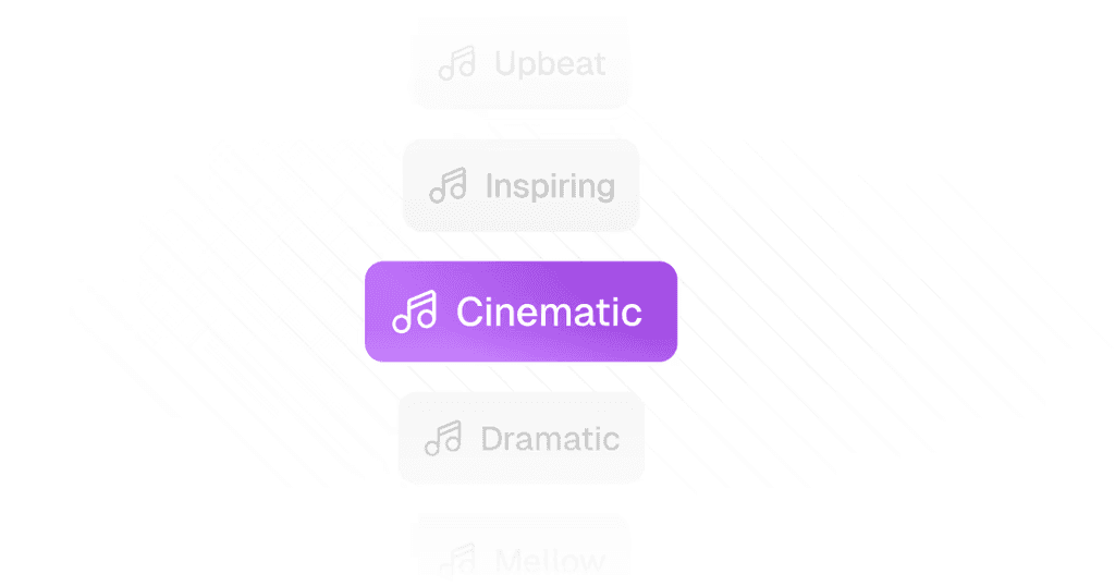
Track selection:
Choose tracks that are neutral and low-tempo.
Choose instrumental only — no vocals, no lyrics
Stick to simple, ambient textures
Avoid anything with dramatic crescendos, heavy percussion, or cinematic tension
Looping & structure:
Use music that loops cleanly or fades naturally
Avoid music that resets with a jarring intro every 30 seconds
For short videos, consider editing music to match the video arc (intro, build, soft outro)
💡 Pro Tip:
Clueso makes it easy to add the right soundtrack to your video with their curated music library. You can also upload your own track to match your brand’s tone.
Embracing silence
Silence is an underrated editing tool. A deliberate pause before a reveal can heighten focus and read as confidence. It signals intentional pacing and gives the viewer space to focus.
Use deliberate silence before key reveals or transitions; it reads as calm and confident
Don’t be afraid to leave micro-pauses between segments without SFX or music.
Exporting Videos
Goal: Deliver crisp, smooth playback optimized for web streaming, while keeping file sizes manageable.
You’ve scripted, recorded, edited, and polished - now it’s time to export. Your goal is two-fold:
Preserve visual clarity (especially fine UI details)
Keep file sizes reasonable for upload, streaming, and playback
Here’s how to export your screen recorded video for both quality and delivery-ready performance:
Exporting master vs. delivery
Always export two versions of your screen video capture:
Version 1: Master File: This is your “forever” copy. These files are huge, but worth it for long-term reuse. They're typically required for archiving, high-end platforms, or future re-edits without generational quality loss.
Export settings:
Codec: Visually lossless mezzanine formats like:
Apple ProRes 422 / 4444
Avid DNxHR HQX
Resolution: Match your source (e.g., 1440p or 4K)
Version 2: Delivery File: This is the version most viewers will see, and your chance to balance fidelity with file size.
Export settings:
Container: MP4 with H.264, H.265, or AV1 codec. (H.264 = compatibility, H.265/AV1 = smaller size at same quality.)
Resolution: Export at your original capture resolution. Don’t upscale; it won’t add detail.
Frame rate: Match your source - usually 30 fps for tutorials, 60 fps if you captured that way.
Keyframe interval: 2 seconds (standard for web playback).
Audio: AAC, 48 kHz, 192–320 kbps for clear voice.
Bitrate guidelines:
1080p30: 12–16 Mbps
1440p30: 18–24 Mbps
4K30: 30–45 Mbps
Quality control checklist
Before publishing, always QC your export:
Watch at 100% zoom, especially if the video includes:
Small UI text
Cursor trails
Transparent overlays
Dark mode UIs (check for crushed blacks)
Scrub quickly across the timeline:
Look for dropped frames
Catch any editing glitches
Confirm VO sync with lip/click motion
Test playback across devices, especially mobile and low-bandwidth scenarios
Checking aspect ratio
Default to 16:9 unless the platform demands otherwise (e.g., Instagram Stories or TikTok)
Don’t record in unusual resolutions like 1280×1024; they won’t scale cleanly
If exporting square or vertical versions, reframe the shot, don’t just crop or stretch
Consistent aspect ratios also help with thumbnail design and end screen layout
A good export respects your audience’s bandwidth while preserving the sharpness and clarity you worked so hard to capture.
Clarity Is the New Craft
Screen-recorded videos are deceptively hard. Anyone can hit “record,” but making something useful, clear, and enjoyable takes deliberate choices at every step — from setup to scripting, from VO to visual effects, from exporting to distribution.
The through-line of all these best practices is simple:
Clarity over flash. Don’t overproduce at the expense of understanding.
Consistency over chaos. Build presets, stick to a brand system, and keep your flow predictable.
Intentionality over autopilot. Every zoom, callout, or sound effect should serve the viewer, not your ego.
Tasteful screen recorded videos respect the viewer’s time. They show only what matters. They feel calm, intentional, and human.
So the next time you record, remember: keep it sharp, keep it human, and above all, keep it watchable.
Frequently Asked Questions About Creating Tasteful Screen-capture Videos
How do I stop my screen recordings from looking cluttered?
Start by cleaning your digital workspace: hide desktop files, close unused tabs, enable ‘Do Not Disturb’, and use a neutral wallpaper. Increase your app or UI zoom to 110–125% so everything is readable, and record a specific window or region.
How do I keep my cursor movements clear in a recording?
Slow down your cursor pace and pause deliberately before and after clicks. Avoid tiny, twitchy movements. A slightly exaggerated, steady cursor is easier to follow, especially on mobile. Disable cursor trails and only use click highlights when absolutely needed.
Do I really need a script for a simple tutorial?
Yes. Even a basic outline with a clear hook, 3–5 steps, and one CTA will make your tutorial tighter, faster to record, and easier to edit. A good script removes rambling and helps you get to the point.
What’s the best way to add a CTA in a screen recording?
Use a single, tangible action (e.g., “Try the template” or “Watch the next video”) at the end of the video. Keep the CTA short, memorable, and shown on-screen for 10-15 seconds with a voiceover. Avoid vague asks like “subscribe” unless that’s the primary goal.
How do I make sure my video doesn’t get cropped in different players?
Keep key visuals and text well inside the safe area. Add a soft background and padding around your footage during export or layout. This gives breathing room and ensures nothing gets cut off in responsive players or embedded views.
How can I make my videos more accessible?
Always include accurate captions (not auto-generated only), use high-contrast text and labels, avoid red/green-only cues, and show both mouse and keyboard paths. When localizing, review auto-translated captions and localized voiceover with a native speaker for tone and clarity.
What’s the best way to add branding without making a tutorial look like an ad?
Use subtle brand elements: consistent fonts, colors, and logos placed in corners or as watermarks. Keep logos small and out of the main content area, and use branded backgrounds or lower-thirds that match your design system.

Co-founder & CBO
Neel is the co-founder at Clueso and handles all things GTM, from marketing to sales to customer success. A Y Combinator W23 alum and IIT Madras graduate, Neel embraced entrepreneurship as an early-career choice. Drawing on his experience building Clueso, he shares advice on building products people want and nurturing strong customer relationships.
