
SEO vs UX: Who Wins When Writing How-To Guides?
You can't afford to choose between SEO & user experience for your help content. Here's how you can strike a deliberate balance between both.
TL;DR
SEO brings users to your how-to guide, but UX determines whether they stay, succeed, and return. You need both to drive real outcomes.
Not all how-to guides have the same use cases. They demand different formats, and placements.
Good structure helps humans and search bots. Think clear formatting, multimedia, and internal linking.
Your how-to guide is often an onboarding coach and a silent support rep rolled into one. But it's often caught in a quagmire between between two forces: Search Engine Optimization (SEO) and User Experience (UX).
On one hand, you need Google to notice your step-by-step guide. That means thinking about search volume, intent, keywords, snippets, and crawlability. On the other hand, you need real humans to use your how-to guide. That means clean formatting, human language, and frictionless design.
And when you get that balance wrong, you feel it.
If your knowledge base articles rank but overwhelm users with dense paragraphs, it won’t convert.
If it’s delightful to read but buried on page three of search results, no one will see it
But when you get it right? Your how-to content drives self-serve success and scales customer education. In this post, we’ll show you how to blend both seamlessly in how-to guides and prove why you no longer have to choose between findability and usability.
SEO’s Agenda: Rank the How-To Guide
Search engine optimization gets your step-by-step guide in front of people. It makes sure that when someone Googles “how to do X,” your guide is one of the top results.
The Mechanics: Keywords, Schema, and Intent
At its core, SEO is a matchmaking system. It connects a user’s search query with your how-to guide, but only if you speak the right language.
Keywords are still the base. Not just the obvious “how to use X,” but long-tail variants of it.
Schema markup helps search engines understand your knowledge base articles’ structure and makes it eligible for rich results.
Search intent matching ensures you are solving the right problem. Is the user looking for a definition, a tutorial, or a tool comparison? SEO gives the best results when you align your step-by-step guide with that intent.
When SEO Backfires: Tactics That Hurt UX
Of course, not all SEO is good SEO, especially when it comes at the cost of readability.
Keyword stuffing doesn’t fool modern algorithms (or users).
Bloated content to stretch word count delay the actual steps, frustrating users.
Over-optimized, robotic tone makes your brand feel impersonal and lifeless.
SEO’s agenda is clear. But if that pursuit compromises clarity or usability, it becomes self-defeating.
Get Started with Clueso
Create impressive videos & docs with AI
UX’s Agenda: Serve the User
If SEO brings people to your how-to guide, UX ensures they get through it. Can they find the exact step they need without scrolling for miles? Are the screenshots intuitive? Is the tone approachable without being cloying?
What Good UX Looks Like: Clarity, Completion, Confidence
User experience is about helping someone accomplish something quickly and confidently. In how-to guides, great UX translates to:
Clarity: Is each step unambiguous and easy to follow? Are screenshots labeled? Is jargon avoided or explained?
Task completion: Can the user actually finish what they started without hitting a roadblock? Does the guide feel helpful?
This is especially critical for product-led companies, where users often onboard or troubleshoot solo. The guide is part of the product experience.
When UX Goes Too Far: SEO Gets Left Behind
Ironically, some UX choices can sabotage discoverability:
Low word count: A minimalist step-by-step guide with only screenshots and sparse text might be delightful to a user already in your product, but search engines have little to index or evaluate.
Hiding key content: Content tucked inside tabs, accordions, or modals might be missed entirely by crawlers, depending on how it’s implemented.
Weak heading structure: Skipping H2s or using non-semantic HTML confuses both screen readers and bots.
UX that hides or de-prioritizes content hierarchy may feel elegant. But if it keeps your how-to guide from surfacing in search or satisfying user intent, what’s the point?
Get Started with Clueso
Create impressive videos & docs with AI
How SEO and UX Affect Each Other
SEO and UX actively shape each other. The way you optimize for one directly affects the performance of the other.
When UX Boosts SEO: Metrics That Matter
User experience decides how Google evaluates and ranks your how-to guide. Why? Because Google is watching what users do after landing on it. The key behavioral metrics here are -
Bounce rate
Dwell time
Click-through rate (CTR)
A well-structured, user-friendly step-by-step guide keeps people engaged. That engagement, in turn, feeds into better rankings.
When SEO Shapes UX: for Better or Worse
On the flip side, the structure you implement on your how-to guide for SEO purposes can either elevate or constrain the user experience.
SEO-friendly formatting like logical H2s and H3s, clear sectioning, and keyword-aligned headers helps readers scan and locate the exact step they need.
Internal linking improves discoverability of your step-by-step guide and reduces cognitive load. When your guide links out to related resources, you deepen value.
But over-indexing on SEO templates can frustrate users who came for clarity.
Google's Algorithm Now Prioritizes UX, Too
In 2026, Google's ranking factors extend well beyond backlinks and keywords. Increasingly, user signals drive the algorithm; which means your UX decisions directly impact visibility.
Key elements include:
Core Web Vitals: These assess how fast your page loads, how stable it is as it renders, and how quickly it becomes interactive.
Mobile-first indexing: If your how-to guide looks great on desktop but breaks on mobile, expect your rankings to suffer.
Helpful Content System: Google rewards pages that satisfy “people-first” intent. That means your step-by-step guide must feel written for a human.
SEO is about being useful after the click, which is UX’s entire mission.
Get Started with Clueso
Create impressive videos & docs with AI
What’s the Real Job of a How-To Guide?
At the end of the day, a how-to guide isn’t about keywords, metadata, or even delightful UX copy. Its true purpose is simple: reduce friction and drive action.
A great how-to guide shows users that:
You understand their context
You’ve anticipated their roadblocks
You respect their time and autonomy
The 3 Core Use Cases for How-To Content
1. Onboarding Flows
Purpose: Onboarding guides help users get set up and start seeing value from your product right away.
What to include:
A clear goal at the top (“By the end of this guide, you’ll…”)
Step-by-step instructions with visuals or embedded video
Pro tips or FAQs woven into the flow
Clear CTAs
💻 UX-first tip: Use collapsible sections or interactive walkthroughs to reduce overwhelm.
🌐 SEO tip: Include specific keywords like “set up [product name] workspace” or “get started with [feature]” to capture search traffic from new users.
📌 Transform Raw Recordings into Polished Content with Clueso
Simply record your workflow, and Clueso automatically generates structured, on-brand video and step-by-step guides that are ready to share.

2. Troubleshooting Guides
Purpose: When something doesn't work or confuses your users, troubleshooting guides are the fastest path to resolution.
What to include:
A clear problem statement (“If X is happening, here’s why…”)
Step-by-step resolution paths
Screenshots or screen recordings for clarity
When to escalate or contact support (with direct links)
💻 UX-first tip: Use headers like “If X, then try Y” — they’re scannable and decision-based.
🌐 SEO tip: Phrase titles in problem-language: “Why can’t I [action] in [product]?” or “How to fix [issue].”
💡Bonus: This reduces support tickets and boosts user independence.
3. Role-Based Workflow Instructions
Purpose: A marketer using your platform will need different steps than a developer or admin. These guides help specific user types get value based on their role.
What to include:
Role-specific terminology and goals (“As a sales rep, you’ll…”)
Custom paths or permissions guidance
Links to related guides based on task complexity
💻 UX-first tip: Use dynamic content or toggle blocks for different personas, so users only see what’s relevant.
🌐 SEO tip: Include role-related modifiers: “for HR managers,” “for sales teams,” etc., so guides appear in more specific searches.
When & How to Add Multimedia
Multimedia elements can improve clarity, especially for complex, multi-step how-to guides. But they need to be used strategically to enhance both comprehension and search performance.
Screenshots: Ideal for UI-heavy steps or pointing out specific buttons, toggles, or dropdowns.
GIFs: Great for demonstrating quick sequences or showing what happens after a click, without the time commitment of a full video.
Short videos or walkthroughs: Perfect for onboarding or when explaining workflows with multiple tools or tabs.
Tooltips and inline help: Best for live product surfaces or interactive guides where contextual support improves flow.
📌 Bring Screenshots to Life with Clueso
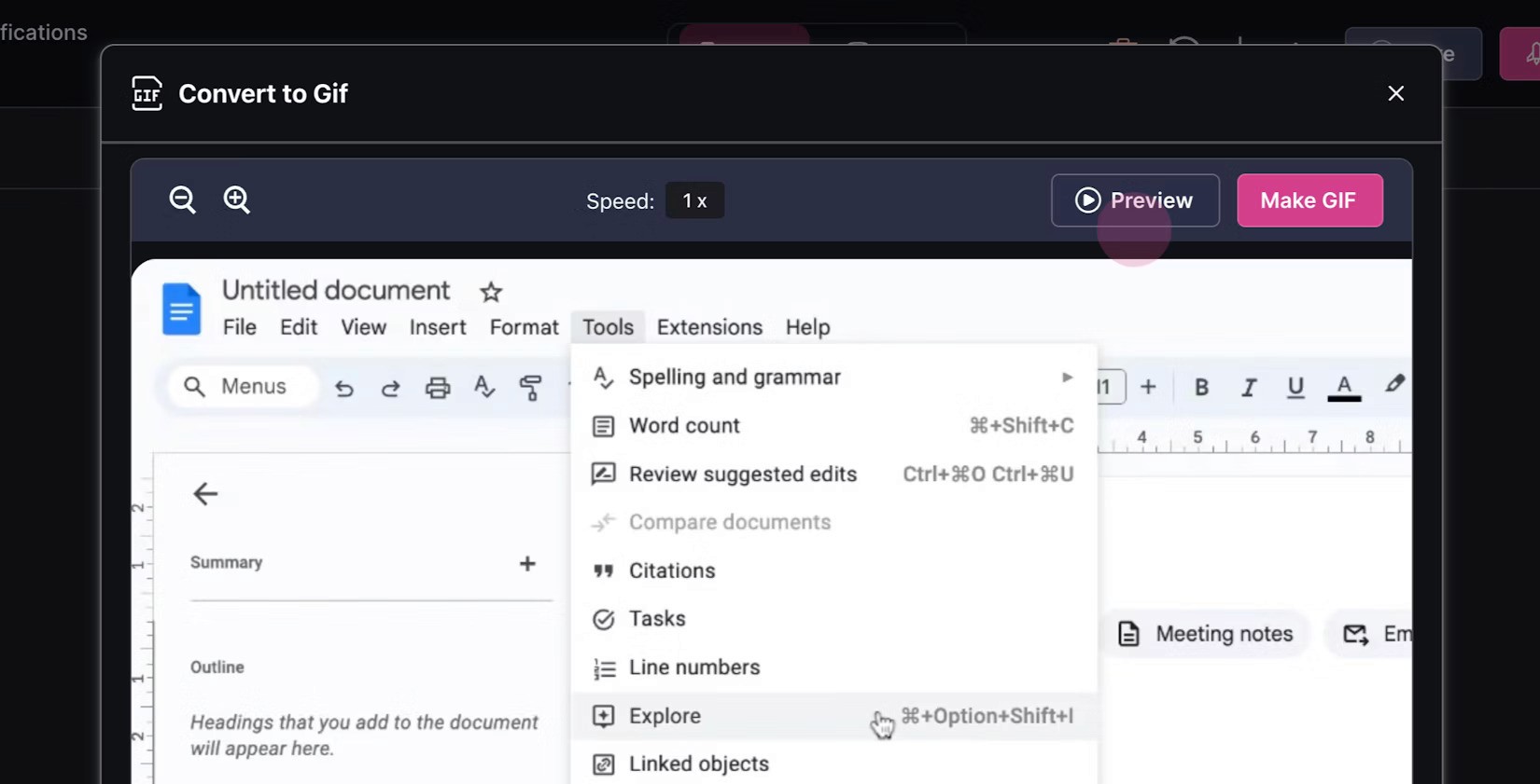
With Clueso, you can turn any screenshot into an animated GIF in a single click. Perfect for step-by-step guides that need a little more action.
With Clueso, you can turn any screenshot into an animated GIF in a single click. Perfect for step-by-step guides that need a little more action.
Best Practices for Using Multimedia
Layer, don’t overload: One GIF or screenshot per step is usually enough. Overloading can slow down load times and overwhelm users.
Position visuals logically: Place media directly after the text step it supports.
Use captions for context: A quick one-liner explaining what the image or video does helps readers quickly orient themselves.
📌 Turn Static Assets to Video with Clueso
Clueso can turn your documents or slides to video. Clueso AI reads them and automatically writes the script. You can add AI voiceovers, visual elements like zoom, spotlight, callout, etc., background music, captions as per requirement and Clueso gives you a high quality video.
UX + SEO Best Practices for How-to Guides
Merging SEO and UX means applying intentional, user-first principles that also signal relevance to search engines. Here are the best practices that boost both visibility and performance of your how-to guides-
1. Use Clear Headings and a Scannable Structure
Modern users don’t read, they skim. And Google crawlers do the same.
Descriptive H2s and H3s help break down your step-by-step guide into logical steps or sections that reflect real user intent.
Short paragraphs, bulleted lists, and step-by-step formats make content easier to digest; especially for task-focused readers looking for a specific fix.
2. Prioritize Fast-Loading Pages
Google’s algorithm pays attention to page speed and layout stability, and so do your users -
Responsive design ensures your how-to guide is legible and navigable on any screen size.
Fast load times are critical for both UX and Core Web Vitals. Compress images, use lazy loading, and avoid bloat from unnecessary scripts or plug-ins.
3. Add Alt Text and Captions to Multimedia
Multimedia boosts engagement, but search engines can’t “see” them. However, they can understand the text that surrounds and describes them.
Alt text improves your chances of appearing in image search.
Captions and annotations on screenshots or videos clarify what users are seeing, particularly useful in a step-by-step guide.
4. Avoid Intrusive Popups and UX Dark Patterns
Remember: if it annoys your user, it’s probably hurting your SEO too.
Intrusive modals (especially ones that appear before any content loads) hurt both engagement and search rankings.
UX dark patterns, like hidden opt-outs or misleading buttons, may increase short-term clicks but kill usability in the long run.
5. Use Action-Oriented CTAs and Internal Linking
Your how-to guide should naturally lead users along to their next steps.
CTAs for the next step create momentum and drive conversions.
Internal links to related guides, feature explainers, or use-case stories keep users engaged and increase session duration.
When you design your content journey with intention, you keep both Google and your users on your side.
Where Should Your Guide Live and Why?
You’ve written the perfect how-to guide. Now, where should it live?
This isn’t just a formatting decision. Placement affects discoverability, UX, SEO value, and even how your audience perceives your brand.
Start with the Big 3: Audience, Discoverability, Content Type
Who’s the audience? (New user, advanced admin, developer?)
How do they get here? (Search, in-product, help widget?)
What’s the content’s purpose? (Support, education, SEO, thought leadership?)
The answers determine the right content placement.
🧾 Knowledge Base
Best for:
Repeatable how-to’s
Troubleshooting guides
FAQ-style product walkthroughs
Why choose Knowledge Base?
Knowledge base is structured, standardized, and often embedded in your product experience. It makes it possible to to filter your knowledge base articles by feature or use case, making it a go-to for fast self-serve help.
💡 Pro tip: Format knowledge base articles with headers, bullet lists, and collapsible sections to maximize both readability and SEO crawlability.
📝 Blog
Best for:
How-to guides aligned with top- or mid-funnel keywords
Educational walkthroughs
Tutorials tied to thought leadership or industry trends
Why choose Blog?
It’s flexible, more conversational, and great for ranking on broad, intent-rich queries (e.g. “how to create onboarding videos”). Blogs are shareable, linkable, and can be added to growth loops via email, socials, and organic search.
💡 Pro tip: Link to relevant Knowledge Base and product documentation content within the blog to drive deeper engagement.
⚙️ Product Documentation Hub
Best for:
SDK setup guides
API walkthroughs
CLI or command-line tools
Auth flows, sandbox testing, developer environments
Why choose Docs?
Developer docs offer version control, code formatting, and live examples. These often integrate with Git-style navigation or Swagger-based API references.
💡 Pro tip: Include “Quickstart” how-to guides alongside reference docs to bridge UX and engineering clarity.
In the Long Run, UX Wins - But Only If SEO Gets Your Audience There
A beautifully written how-to guide that no one finds is as ineffective as a high-ranking one that confuses readers. Visibility without usability is a bounce. Usability without visibility is a missed opportunity.
The truth is, you can’t afford to choose between SEO and UX. The most impactful guides strike a deliberate balance: they show up for the right searches and deliver a seamless experience that helps users complete tasks with confidence.
So what’s the real win?
Clear structure that supports both search crawlers and scanning humans
Multimedia that enhances understanding and respects accessibility
Placement strategies that meet users where they are
So let’s stop asking whether SEO or UX wins. The only real winner?
The user, when both disciplines play on the same team.
Frequently Asked Questions About How-To Guides
Can a how-to guide be both SEO-friendly and user-friendly?
Yes. With the right structure, formatting, and content strategy, you can create how-to guides that are both SEO-friendly and user-friendly.
What are some SEO best practices for how-to content?
For how-to content, some SEO best practices are - use descriptive headings, keyword-aligned titles, meta tags, structured data (like schema markup), and internal links.
What are the risks of over-optimizing how-to guides for SEO at the expense of readability?
Over-optimizing how-to guides for SEO can make them keyword-stuffed, repetitive, and harder to follow, which hurts comprehension and trust. When readability drops, users disengage. It leads to higher bounce rates, lower task completion, and ultimately weaker SEO performance anyway.
How does UX influence search rankings?
Good UX improves dwell time, reduces bounce rates, and encourages engagement - all of which are ranking signals for Google.
Should I use videos and screenshots in how-to guides?
Absolutely, you should use video and screenshots in how-to content. Visuals enhance comprehension. Just ensure they're paired with alt text and explanatory copy for SEO and accessibility.

Content Writer
Pallavi is a seasoned marketer and content strategist, having previously led content teams at VC-backed B2B SaaS startups, including her own. She now advises B2B product companies on creating stand-out content for greater brand awareness.
